Sunday, 30 May 2010
Vintage Card – Happy Birthday, Lynne!
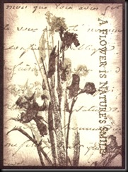
15 very kind comments from lovely people at Sunday, May 30, 2010I was really enjoying playing with Brown and Cream – I consciously tried to avoid it for a long time, after using these colours WAY too much for years :) So, I carried on, did another Image transfer and made this:-
The background is walnut ink. I’ve added some Mica flakes to the d/s tape behind the lace and some micro beads to the centre of the embossed flowers. Hard to see the Mica flakes in the photos but they really glisten nicely, without too much glitter ;)
This went to a lovely friend of mine whose birthday is today, so hopefully, she’ll have received it in the last few days :D Happy Birthday, Lynne M!
Saturday, 22 May 2010
Lots to do – Swirls and Flourishes
24 very kind comments from lovely people at Saturday, May 22, 2010The background is alcohol inks on glossy card, with some gold mixative. The dragonfly (LOVE this Non Sequitur image) was first stamped on the background, masked then I stamped the Hero Arts Art words in Wild Plum ink, followed by the swirls, which are gold embossed. I coloured the dragonfly a little with Copics and some white pen, then stamped again on Vellum, coloured with Copics (on the back), cut out and attached over the original image. I used Glitter Glaze on some of the wings and body, which you can’t see here. 'Imagine the Possibilities' from Elusive Images.
Friday, 21 May 2010
I’m really not good with prescriptive stuff – if someone tells me I have to use such and such a ‘sketch’ or certain colours, I find it really difficult because it restricts me. BUT I do love these PDCC colours this week – AND Versamagic do the perfect colour matches. They seem to be the only company to do Pastel ink colours really well.
And here’s the card – lovely, restful, colours.
Thursday, 20 May 2010
Wednesday Stamper and Theme Thursday – Orange hands
18 very kind comments from lovely people at Thursday, May 20, 2010Wednesday, 19 May 2010
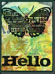
I’m just sending a card to a friend and wanted to use these stamps on something quick that I could send – the bird, butterfly and ‘Hello’ were gifts from her. Aren’t they great stamps? So, I just did two quick ATCs.
This one’s stamped on some old Scratch paper – you can see where I’ve stamped ‘off the edge’ on my backgrounds.
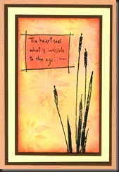
This is some of the ‘Ecoline mess’ watercolour paper, using one of my favourite words stamps. I love this quotation.
Tuesday, 18 May 2010
I really NEEDED to stamp today - lots of things on my mind – but I couldn’t concentrate and wasn’t feeling very imaginative. So, I stamped up some bits and did quick and easy with backgrounds I’ve already made.
The first one’s Alcohol inks, mounted on a wax resist background, made with waxed paper and a Cuttlebug folder. All main images (and words) are Penny Black.
This one’s on a Versamagic background – text and flowers, but you’d probably have to enlarge to see the text.
The third one is just inks on glossy card, mounted onto a salted background.
Monday, 17 May 2010
I was wanting to make something for the Lots to Do Challenge – Collage Stamping – but I also wanted to try out this stamp I got for a silly price (about £2.50) from Port Sunny, so I thought I’d do a postcard.
I though I hadn’t done any real collage stamping for a long time – not since collage stamps became popular, followed by the distressed look, which followed the vintage fad but meant that messy stamping without masking was more acceptable. Then I realised that I still mask a lot, even if not in the same way I used to. I like creating my own backgrounds and that often means having to mask my main images - or some aspect of what I’m doing - first, so it’s something I don’t think about too much – I just get on with it.
Anyway, having said all that, it hasn’t turned out brilliantly, lol and it’s pretty simple – just masked birds with a Postcard background and a couple of design elements. I used Wild Honey and Barn Door Distress inks then Prismacolour pencils for a change. Back to work :)
Friday, 14 May 2010
Thursday, 13 May 2010
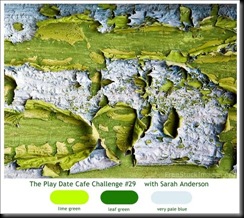
Just been playing with this week’s PDC (Play Date Café Colour Challenge) colours and boy, did I find it difficult, until I thought of this idea.
I attached the Flutterby Girl after doing the background in the two greens, then coloured her wings palest blue. They look a little deeper than they were because I embossed everything with clear EP after I’d finished, which sort of deepens the shade a touch. I used Colorbox Pigment inks for this one and Tombow Pens for the Flutterby girl.
Just logged on to discover that I've won the Play Date Café’s Winner’s Cup for last week!! AND I won a prize of designer papers. Thank you all :)

Wednesday, 12 May 2010
Had to do something quick and easy to relax after the stress of doing the previous two cards, lol, so here’s my TMTATC Travel entry.
Tuesday Taggers – Step out of your Comfort Zone
11 very kind comments from lovely people at Wednesday, May 12, 2010Well, I’m sure it won’t look like it but it’s taken me all afternoon to make these VERY clean and simple cards – well out of my comfort zone – I don’t do clean and simple, or very rarely. I’m sure most people would do these in half an hour – at the most – but I really struggled.
I use the Penny Black flowers a lot and, occasionally, in this way, with felt tip pens – but the Stampendous flowers were done with paper piecing and silver embossing AND it’s layered on silver mirror card, which I’ve probably had for about 8 years. I find it much, much easier to work with colour. I didn’t think I was a ‘more is more’ type of person, but perhaps I am?
The pink paper (Scrapbook paper for the blooms themselves) really IS pink – not this deeper colour you can see here. Got a new scanner, so I obviously need to fine tune it – way too many options on it…
Tuesday, 11 May 2010
I enjoy the Lots to Do Challenges, so thought I’d have a play.
I’ve stamped this on a piece of alcohol inked glossy paper. I keep forgetting about these images because they were the last we had pressed before the shop closed but I really like them :)
Monday, 10 May 2010
Maths Monday and what am I doing? Anything but Maths…
Sunday, 9 May 2010
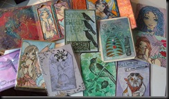
Here are some of the ATCs I took with me to trade
Here are the ATCs I traded for :) Thank you, girls!
Friday, 7 May 2010
PS OH NO!!! Just found out from HSNW website that Stamp Camp won't be there - drat! That's one of the main reasons I was going because I love her stamps!! I may actually struggle to spend what little money I do have, having seen the list of exhibitors. Drat, drat and double drat!!
Labels: KCUK
Thursday, 6 May 2010
Wednesday Stampers (Flowers) & Theme Thursday (Vintage)
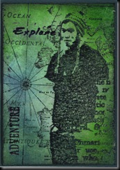
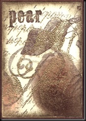
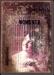
22 very kind comments from lovely people at Thursday, May 06, 2010I was playing with brown, cream and gold – this month’s ATC theme on KCUK – and messed up (firstly cos the text stamp I thought was clean had green ink on it and the gold didn’t colour it, then cos the ink on my image transfer wasn’t quite sepia, having more of a reddish hue), so played some more and they became vintage ATCs.
I need some to take to Port Sunny with me on Saturday, so I’m quite pleased that it worked out this way, to be honest :)
Tuesday, 4 May 2010
Two cards here cos I changed my mind half way through…
This one’s been glimmer misted but of course you can’t see that – and I think the colours go together better in real life :) It looks more true to life in PSP but not on this page – strange. The background card perfectly matches the Pool ink on the face background and is a kind of Jade colour - the turquoise is a slightly different shade from what you can see.
(NOTE to Jan - I've tried but can't find an email link or address anywhere on your blog, so these stamps are from Crafty Individuals. The ones below are (L to R) Paperartsy (Ink and the Dog), Paperbag Studios and again, Crafty Individuals.)
I used three of the new Distress inks on this tag and this lovely Urban Snapshots image (Paperartsy), coloured with watercolour pencils. Just checked it and the top boy’s hair has dried blobbily (is that a new word, lol?) so I’ll need to redo it. Done it, but it’s a bit heavy. I’m not very good with hair :(
Not sure they look as if they’re having fun, either :) Someone just commented that they actually look as if they're about to be told off - made me giggle but absolutely right!! Thanks, Carol :)


