Thursday, 18 October 2012
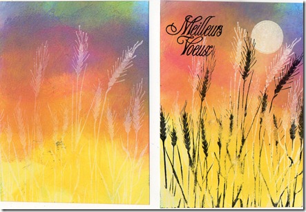
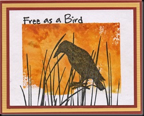
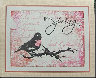
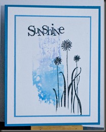
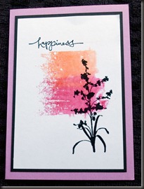
This is my favourite technique and has been for about 14 years, so it’s my entry for the Simon Says Stamp & Show Challenge, which is ‘FAVOURITE’.
When staying with a friend, I promised her I’d show her how to do a Versamark resist, but we were so busy, we left it until near the end of my stay and, of course, events conspired to prevent us getting around to it.
I’ve just sent her a parcel with instructions and some samples.
Labels: RESIST, Techniques
Sunday, 5 February 2012
I did get to play a little with my acrylic blocks but have been struggling to get decent photos. Decided to blog them anyway, despite the fact that the variations in shade and colour are just not showing up – grrr!
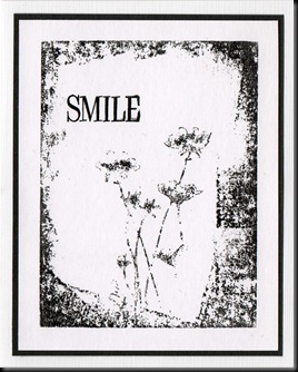
No problems with this one because it’s just black and white.

I’ve done more but I’ll save them for another time. I did one on my trusty old large Hero Arts shadow stamp and I quite like that one. Takes me back to when we had the little Stamp Club in the shop. We did quite a lot of mono stamping then – probably around 5 or 6 years ago - and it was so much fun.
Edited: INSTRUCTIONS
Chalk inks also work really well. Haven’t done any samples but that’s what we used years ago, when they first appeared on the market.
It’s not my technique – it’s a standard printing technique which has been used for eons but it’s great for experimenting with. Just wish I had more time to play. Any more questions, please do ask.
For more information on monoprinting the printer’s and artist’s way, see here.
__________________________________________________
The ice has almost melted and the sun is shining, so I may just venture out for a bit of fresh air. No snow here, though. Hope you’re all staying warm x
Labels: How to, Monoprinting, Techniques
Thursday, 2 February 2012
This is the challenge I sent for KCUK this month – printing with acrylic blocks – otherwise known as mono printing. There are so many possibilities for this technique and I hope to play with them as soon as I’ve finished work for the week, but for now, here are a few simple samples.
For these I just used felt tip pens in two different colours, then spritzed them with water and printed onto white card.
Labels: Monoprinting, Techniques
Saturday, 28 August 2010
F for Faux Batik, Flourish, Flicked water technique and Flowers
22 very kind comments from lovely people at Saturday, August 28, 2010Couldn't resist using lots of things beginning with 'F' this time but at least I was a good girl and not used BAD words, lol. There's Faux Batik, Flicked water, a Flourish and Flowers.
- Stamp image(s) in Versamark or clear Embossing ink, then emboss in clear powder.
- Apply colour, using your favourite method but be sure not to use permanent or pigment inks, which will cover the embossed images and spoil the effect. Water based inks, such as Vivid, Distress, Adirondack, Big 'n' Juicy, Kaleidacolor, Memento, Marvy, etc etc are ideal. If there’s ink on your embossing, wipe off with a piece of kitchen towel or a baby wipe..
- Cover the embossed card with a piece of kitchen towel (newsprint or brown paper work just as well). Set an iron to HOT (no steam) and IRON over the material covering the embossed bits, leaving it over them for 15 seconds or so. You know your own iron, so you’ll know how hot it’s getting. If you need to, lift up the paper/kitchen towel to see if the embossing powder has lifted up.
- When embossing powder is removed, overstamp with more images (or the same – works particularly well with flowers and people, creating a sort of shadow effect).
- Clear emboss new stamping if you like, to create dimension.
Someone asked me what the Flicked water technique is and it's just what it says. Spray (or pour) a bit of water into the palm of your hand, slightly cupped, then randomly flick drops of water onto your inked background. Heat with a heat tool and you have another great little effect.
Labels: Alphabet Swap, How to, Techniques
Tuesday, 24 August 2010
Let’s Ink it Up #1 – Anything Goes - with a Twist
28 very kind comments from lovely people at Tuesday, August 24, 2010Labels: GRID TECHNIQUE, Techniques
Wednesday, 17 February 2010
Here’s another way to use up those everlasting Twinkling H20s. They just don’t seem to ever use up, do they, lol? Especially not if you have the larger sized pots as I have. I’ve never seen anyone else do this and even if they did, I didn’t know that, so I was quite pleased with this technique. It WAS when Twinklers first came out. 
This is the ‘by product’ (both very shimmery)
-
Firstly choose your H20s – not too many and not too many stark contrasts, though by all means experiment :) -
Add water to them, either with your paintbrush or the spray and give them time to blend a little. You don’t want the paint to be too thin when you paint it on. -
Lay a piece of mulberry paper over the card and spray with water until it’s pretty wet. -
Paint the H20s randomly over the mulberry paper, adding more water to lighten the colour if it starts to get too dark.


If you need to, spray with more water, then leave for a little while.
-
When you’ve allowed time for the colour to transfer, peel the mulberry paper from the card and lay them out to dry separately. You can heat set with a heat tool, though the Mulberry paper goes brittle if you do. The card is fine.
Labels: Techniques, Twinkling H20 bacgrounds
Tuesday, 16 February 2010
Backgrounds – Marvy Metallics
14 very kind comments from lovely people at Tuesday, February 16, 2010Someone asked me about Marvy Metallic backgrounds the other day and I’d been planning a few background sessions for here, so here’s the Marvy Metallic one :)
All you need is a spritzer (a common old garden spray will do – don’t go to any unnecessary expense), Marvy Metallic markers (or ANY OTHER WATER BASED BROAD NIBBED METALLIC PENS), glossy cardstock (I used black and white), a Craft sheet or newspaper to protect your work surface and some Cling Film (Saran wrap for those in the US)
Shake those pens up and down – see, you’re getting exercise while you do this – then pump until the ink is flowing freely. You can either do this on some scrap paper, your worksheet, or the actual card you’re working with – which is what I did :)
Then add scribbles and dots of the marker randomly over the glossy card.
Now spritz with water.
You can, of course, also scribble the markers onto your Scrap Sheet and ‘mop them up’ with cardstock, but beware, they do muddy! So keep them apart. I have to confess that I don’t like the results as much when I do that.
Then
a) Leave to dry naturally
b) Place another piece of card on top, smooth down and pull apart carefully (it’s worth enlarging the white card on the right, to see the gold on it – it’s lovely)
c) Place another piece of card on top, twist and pull off
OR
d) Crinkle up some Cling Film, spread it over the ink and LEAVE TO DRY!
I know this last one is blurred but it’s pretty!
Then use to your heart’s delight, either for stamping on, behind acetate or as a matte.
A few people have said they will try to get these pens - PLEASE DON'T!!! This tutorial is for those who actually already have them and need to find a use for them - you can stamp with them, too and they do look good on black. But you can get just (or almost) the same effects with metallic acrylic inks, metallic acrylic paints, Lumières and even with Mica powders (Pearl-Ex, Moondust, Faerie Dust, Perfect Pearls, etc). You need some kind of medium to hold them in place but you don't need anything too fancy - the ever resourceful Jo used spray starch in a workshop at Stamp Club a couple of months ago and it worked fine, giving very similar effects :)
Twinkler Backgrounds tomorrow!
Labels: Marvy Metallic Backgrounds, Techniques
Saturday, 13 February 2010
Bleeding Tissue – not swearing, honestly!!
10 very kind comments from lovely people at Saturday, February 13, 2010After playing digitally and still being somewhat incapacitated, I had itchy fingers, so decided to play and get them inky :)
BLEEDING TISSUE TECHNIQUE
Supplies
- Cardstock
- Spritzer filled with water (hopefully, cleaner than mine)
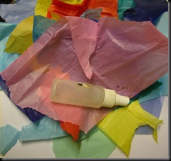
- Scraps of coloured Tissue Paper
NB – the cheaper the tissue paper the better – more expensive varieties don’t bleed and we want it to bleed…
Instructions
- Spritz cardstock thoroughly with water.
- Tear off scraps of tissue in your chosen colours and lay down on the wet card, smoothing down as you go.

- Spray with water again.
- Leave for a while – depends on how dark you want your card/paper to be – if you want paler colours, then don’t leave for too long, if deeper, leave for longer – then peel off the wet tissue and voilà – Bleeding Tissue Backgrounds!
TIP don’t leave it until it dries or the tissue may stick to the card!
Here are my results – still wet, so I can’t scan them and it’s dark now, so the colours aren’t totally accurate. If you click to enlarge, they do look better and they’ll look a whole lot better once they’re stamped. I love the little veins the crumpled tissue leaves – a bit like mulberry papers when painted with Twinklers.
I’ll try to make some cards with them later, all being well. One of the things I wanted them for was to make the Valentine’s card Roni made here. Hers look really good made with Distress inks, but I’m a bit ‘off’ Distress inks at the moment, so thought I’d try something different. I'll be revisiting other 'oldie but goodie' techniques in the next few days, so watch this space.
Labels: Bleeding Tissue Technique, Techniques
Sunday, 8 November 2009
Colour ATC Technique – as requested :)
8 very kind comments from lovely people at Sunday, November 08, 2009I feel more than a little embarrassed about posting this as a technique because it really is so EASY, but here you go…
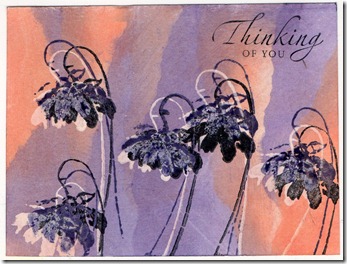
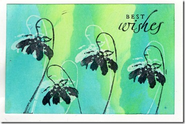
I used just three shades of Ecoline inks – Cerise, Cyan and Yellow – then, taking a sheet of card (thickish) or watercolour paper (I used hot press smooth) I just painted them on randomly (with thick brushes) and left them to dry. What a cheat? The colours blend beautifully and create all those shades you can see on the ATCs. On some, I wet the card or paper first, then added the inks, on others I spritzed after painting, then mopped up excess colour with another sheet of card/paper, so I ended up with lots of variations – some muddier looking than others, some paler.
Word of warning – it looks YUKKY before you stamp it and the white highlighting really does make all the difference :)
I did try this with Adirondack reinkers but they are too highly pigmented, so the colours are too dark. Great for inkpads but not for techniques like this. I am intending trying the same thing with Vivid Reinkers because I have quite a lot of those – I’ll upload my results when I do.
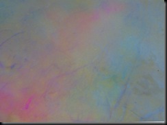
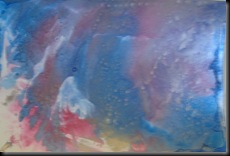
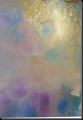
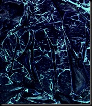
Here are a couple of the backgrounds BS (Before Stamping).
I think the first two were spritzed VERY lightly. Don’t they look YUKKY?
The second two pieces were wet before I started and then were spritzed a little more before being allowed to dry. These look much nicer unstamped.
Labels: How to, Riot of colour, Techniques


