Sunday, 8 November 2009
I feel more than a little embarrassed about posting this as a technique because it really is so EASY, but here you go…
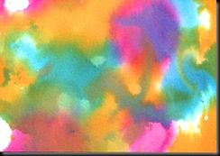
I used just three shades of Ecoline inks – Cerise, Cyan and Yellow – then, taking a sheet of card (thickish) or watercolour paper (I used hot press smooth) I just painted them on randomly (with thick brushes) and left them to dry. What a cheat? The colours blend beautifully and create all those shades you can see on the ATCs. On some, I wet the card or paper first, then added the inks, on others I spritzed after painting, then mopped up excess colour with another sheet of card/paper, so I ended up with lots of variations – some muddier looking than others, some paler.
Word of warning – it looks YUKKY before you stamp it and the white highlighting really does make all the difference :)
I did try this with Adirondack reinkers but they are too highly pigmented, so the colours are too dark. Great for inkpads but not for techniques like this. I am intending trying the same thing with Vivid Reinkers because I have quite a lot of those – I’ll upload my results when I do.
Here are a couple of the backgrounds BS (Before Stamping).
I think the first two were spritzed VERY lightly. Don’t they look YUKKY?
The second two pieces were wet before I started and then were spritzed a little more before being allowed to dry. These look much nicer unstamped.
Labels: How to, Riot of colour, Techniques


8 very kind comments from lovely people:
those second two are gorgeous Cath. have you tried it with salt yet?
Easy, as you say, Cath, but aren't the simplest ideas often the best? The colours on these are gorgeous, and look so good when stamped over.
Thanks for sharing - I fancy having a go at that when I am done with the bags
thanks Cath
Love your ATC's Cath the colours are fab
Dot
Thanks for the tutorial Cath. Such a beautiful background effect and your ATC's are fab.
Love the story of your day out with Ugly - she obviously had a great time!
Hugs, Sylvia x
I love the front page for the skinny alphabet book and can't wait to get mine to see the rest!
The colour technique looks stunning.... so vibrant and I love best the ones you call yucky!
Bestest
Jo x
I really like these - I adore vivid colours at any time, and these are great combos!
Post a Comment