Saturday, 20 November 2010
Staying with the ‘one colour plus white’ theme because it’s easy and quick. I feel guilty for making such simple cards and ATCs – I like to put a bit more work into them, rather than simply stamping and layering, but hey ho! Needs must when time is precious… These have all been clear embossed, then most of them have been cuttlebugged, lol ;)
Labels: ATC swap, KCUK, Quick and Easy, THE 'C' WORD
Friday, 19 November 2010
Labels: Quick and Easy, THE 'C' WORD
Thursday, 18 November 2010
Wednesday, 10 November 2010
Labels: INKY BACKGROUNDS, Quick and Easy
Monday, 8 November 2010
Labels: INKY BACKGROUNDS
Sunday, 7 November 2010
Christmas – White and one colour
22 very kind comments from lovely people at Sunday, November 07, 2010Labels: Quick and Easy, THE 'C' WORD
Sunday, 10 October 2010
Really should be working and have an essay open here and books all over the kitchen table but couldn’t resist a quick play with a couple of my new stamps.
Had a great day at Port Sunny, meeting up with lots of old friends and some lovely bloggers I’d only ever ‘seen’ online, but never met before, which was brilliant. Good to meet you, girls!
Labels: INKY BACKGROUNDS
Monday, 4 October 2010
Labels: INKY BACKGROUNDS, Quick and Easy, Riot of colour
Tuesday, 14 September 2010
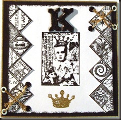
K for King 4x4 page and PDCC 46 – Colour Splash
17 very kind comments from lovely people at Tuesday, September 14, 2010Here’s my K page for the Chunky Alphabet swap, which also happens to fit into the PDCC 46, which is a Colour Splash (Black and white with a splash of Gold, Pink or Copper). I’m not over pleased with it because it didn’t work out exactly as planned but I really don’t have time to play around with it right now. ( I managed to sneak an hour yesterday to make this, lol – hope to get to the next two letters later in the week!)
And K for knots, he, he!
Monday, 13 September 2010
Crafty Cardmakers Challenge 29b - Alcohol inks
27 very kind comments from lovely people at Monday, September 13, 2010Labels: CRAFTY CARDMAKERS CHALLENGE
Friday, 10 September 2010
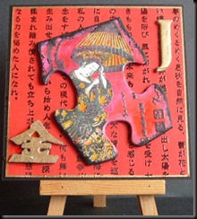
Back to J again for my 4x4 pages and although I stayed with the J for Jigsaw theme, I added a Japanese slant this time.
Labels: Alphabet Swap, Fat (chunky) book, KCUK
Labels: Alphabet Swap
Thursday, 9 September 2010
GPP Street Crusade #44 – Paint scraping
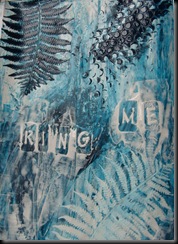
36 very kind comments from lovely people at Thursday, September 09, 2010Found the latest GPP Street Crusade yesterday and just had to have a go – especially cos my mind was in turmoil over something at the time. The brief is to use acrylics in journal pages but using only a scraper – or old Credit card/store card – and maybe some stencils of some kind.
I gessoed my altered book pages first, using an old credit card, then applied the paints in layers, spritzing with water now and again, followed by stencilling using a fern stencil I love but haven’t used very often. It’s a metal stencil so I couldn’t move it around enough to get random ‘off the page’ imprints, which I would have liked.
Labels: EXPERIMENTS, GPP Street Crusades
Monday, 6 September 2010
Crafty Cardmakers – Clean and Simple
28 very kind comments from lovely people at Monday, September 06, 2010This week’s Challenge over at Crafty Cardmakers is Clean and Simple.
I don’t do a lot of CAS because I love to play with inks, but I do really enjoy simple card designs now and again. I’ll be making a DT card for the ‘Spotlight’ part of this challenge, but couldn’t resist making a couple of very clean and simple cards for fun.
Sunday, 5 September 2010
Labels: Alphabet Swap
Friday, 3 September 2010
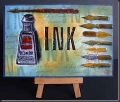
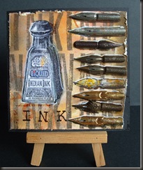
I for Ink – Alphabet swap and Theme Thursday - Square
16 very kind comments from lovely people at Friday, September 03, 2010Here are my letter I’s for both Alphabet swaps – first the Postcard swap for Lots to Do and the 4x4 for the KCUK Chunky book.
Labels: Alphabet Swap, KCUK
Thursday, 2 September 2010
Alpha Postcards and 4x4 pages
14 very kind comments from lovely people at Thursday, September 02, 2010Been busy getting ahead with these two Alphabet swaps the last couple of days, so I don’t have to worry too much in the next couple of weeks – best laid plans of mice and men? I’m rushing and it shows, but these are my swaps for G & H
Labels: Alphabet Swap, KCUK
Wednesday, 1 September 2010
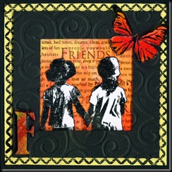
4 x 4 Alphabet Swap – F for Friends…
20 very kind comments from lovely people at Wednesday, September 01, 2010… and Frame and Flutterby (well, that’s what I call ‘em, lol)
Labels: Alphabet Swap, KCUK
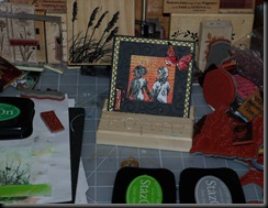
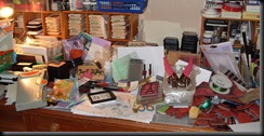
The Bank Holiday this week has made the days seem to come way too soon. Can’t believe it’s Wednesday already!! It’s time to SNOOP - WOOHOO!!! If you don’t know yet what What’s on Your Workdesk Wednesday is all about (and you really, really SHOULD DO) then pop over to Julia’s blog to spy on what everyone’s revealed this week. It really is a lot of fun!! (Oops, I've put the wrong number up there, so my link is taking people to the wrong entry - duh! My apologies - this is WOYWW 65, lol!
Anyway, here’s a snippet of my desk this week, which actually contains a WIP (Work in Progress), lol. NOT showing my whole desk this week cos very little has changed, apart from the fact that it’s probably worse than it was!!!!!
That stamp of grasses you can see to the left hand side is one of my favourites, although I don’t use it too often because it’s pretty limiting. Mum sent it from New Zealand, so I treasure it and I may now have the perfect excuse to use it again.
This may well be my last WOYWW for a while now – not sure yet of the date but I’ll be starting a Full time Course this month and I suspect it will be next week or the week after but I have LOADS of stuff to sort out and to deal with before then, especially after 4 weeks of my OH being home, therefore doing absolutely NAFF all in the house!!! I’ll miss you all.
Thanks to everyone who’s left comments in the last few weeks – I really appreciate your kind words and your sense of fun. I’ll try to get round to you all this week!
Labels: WOYWW
Tuesday, 31 August 2010
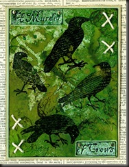
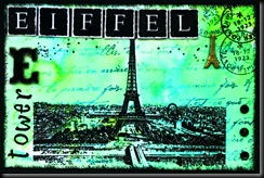
KCUK ATC Swap – Letters of the Alphabet
13 very kind comments from lovely people at Tuesday, August 31, 2010Sunday, 29 August 2010
Labels: STAMPED INKY BACKGROUNDS
Saturday, 28 August 2010
F for Faux Batik, Flourish, Flicked water technique and Flowers
22 very kind comments from lovely people at Saturday, August 28, 2010Couldn't resist using lots of things beginning with 'F' this time but at least I was a good girl and not used BAD words, lol. There's Faux Batik, Flicked water, a Flourish and Flowers.
- Stamp image(s) in Versamark or clear Embossing ink, then emboss in clear powder.
- Apply colour, using your favourite method but be sure not to use permanent or pigment inks, which will cover the embossed images and spoil the effect. Water based inks, such as Vivid, Distress, Adirondack, Big 'n' Juicy, Kaleidacolor, Memento, Marvy, etc etc are ideal. If there’s ink on your embossing, wipe off with a piece of kitchen towel or a baby wipe..
- Cover the embossed card with a piece of kitchen towel (newsprint or brown paper work just as well). Set an iron to HOT (no steam) and IRON over the material covering the embossed bits, leaving it over them for 15 seconds or so. You know your own iron, so you’ll know how hot it’s getting. If you need to, lift up the paper/kitchen towel to see if the embossing powder has lifted up.
- When embossing powder is removed, overstamp with more images (or the same – works particularly well with flowers and people, creating a sort of shadow effect).
- Clear emboss new stamping if you like, to create dimension.
Someone asked me what the Flicked water technique is and it's just what it says. Spray (or pour) a bit of water into the palm of your hand, slightly cupped, then randomly flick drops of water onto your inked background. Heat with a heat tool and you have another great little effect.
Labels: Alphabet Swap, How to, Techniques
Thursday, 26 August 2010
Embossed, with eyelets.
This is a scan.
Labels: Alphabet Swap
Wednesday, 25 August 2010
Wow – Wednesday already!! How did that happen and where’ve the last few days gone to????
Labels: WOYWW
Tuesday, 24 August 2010
Let’s Ink it Up #1 – Anything Goes - with a Twist
28 very kind comments from lovely people at Tuesday, August 24, 2010Labels: GRID TECHNIQUE, Techniques
Woohoo! I made Ginger Gem again!
10 very kind comments from lovely people at Tuesday, August 24, 2010Labels: Award
Monday, 23 August 2010
Crafty Cardmakers’ Challenge 28 – Video Inspiration – DT example
15 very kind comments from lovely people at Monday, August 23, 2010The theme for this week’s Crafty Cardmakers is a Lady Gaga Video.
See stills on the Crafty Cardmakers website if you prefer not to watch the video – definitely not my cup of tea, lol!
From the video, I focused on silver, white, diamonds and bling but also on the part where she looks in a mirror, which is why the frame is there.
I stamped the image (Time to Stamp Glamour Girls) in Brilliance Starlite Silver on Glossy card, then cut to fit the frame (Life’s Journey from K&Co). The background is stamped with a Kars’ Harlequin Background, then heat embossed with a Silver/White sparkle Embossing powder.
The silver mesh (from my stash) was attached with a bit of double sided carpet tape (Wilko special, lol) behind the frame, then with 6 silver square brads – 3 at top left, 3 at bottom right – turned to look like diamonds. I didn’t want it to be firmly attached.
The word ‘Divine’ was from the same stamp plate and was stamped and embossed with Fine silver Embossing powder, then layered onto silver mirror card.
Wire embellishment (Woodware) was attached with Glossy Accents and after attaching the stamped layer to a piece of silver mirror card, then to a folded white card, I attached the frame to the front – again with super strong Double sided carpet tape, to keep it secure.
The prize for this week is approx £10 worth of Die cuts from
We’d love to see you take part this week.
Thanks for looking.
Saturday, 21 August 2010
After struggling with a DT project which was way outside of my comfort zone, I decided to play for a little while this afternoon – just because!! Happily, the colours I used (which are some of my favourites) just happened to fit into this week’s Playdate Café Challenge, which is this colour scheme.
It doesn’t look quite straight, but it is – it looks that way because I mounted the top layer onto thick foam tape for a change – the scanner has obviously struggled with the 3D effect.
All Tim Holtz (Stampers Anonymous) stamps, with Distress inks in Tumbled Glass, Bundled Sage and Stormy Skies, then some Adirondack Pool added.
This is another scrapling I made quickly, yesterday.
Thursday, 19 August 2010
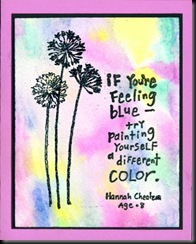
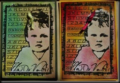
Just had a couple of hours to play, so I made some backgrounds with Ecoline inks – watercolour paints. I just used a pipette to put a few drops of red and yellow on a non-stick craft mat, then spritzed with water and picked up the colour with some white card.
Then stamped the Paperartsy image (and clear embossed) and the Hero Arts Friends stamp (using Wild Honey Distress ink). The words are from various stamp sets and are all clear embossed.
Theme Thursday challenge for this week is Children.
Gingersnap have a red, yellow and orange challenge but they also have a Paint challenge, so this fits both.
Rainbow Lady’s Challenge for this week is ‘Paint it’
Don’t think I’ve ever entered a card for so many challenges in one go – quite coincidental, lol.
(I’ve changed the image to a photo because the scan made it look more ochre than orange and it was WAY too bright!)
Wednesday, 18 August 2010
What’s on Your Workdesk? Wednesday 63
38 very kind comments from lovely people at Wednesday, August 18, 2010It’s been one of those weeks and here’s the proof in all its glory. NOT a very tidy desk this week at all – in fact, it’s as it very often is, lol.
I made a few things really quickly, one after the other, and have been out nearly every day with John, so I left it as it was when I finished, without moving a thing or cleaning a stamp and haven’t touched it since.
Now you see the chaos I really work in, he, he. I did proudly display my latest creations in my beautiful WOYWW easel, though – you can see it, honestly, if you look VERY closely – he, he. You can also see a card front I got from Vix yesterday – lovely colours – and I like those stamps – ooh, disaster!
I should probably be ashamed, but guess what? I’m not, really. I nearly always end up working this way, hunting for bits to use beforehand so that I have things to choose from and I rarely have more than this amount of space to work in – unless it’s something bigger, lol. Even if I start with a totally tidy and clear desk (which is rare) it ends up looking like this. It’s probably going to get worse before it gets better cos I won’t have time to tidy it but NEED to stamp soon or I’ll go nuts! It won’t take me long to tidy that lot up when I’m ready. Every item has its own home to go to. If only you could see the floor…


