Tuesday, 31 August 2010
KCUK ATC Swap – Letters of the Alphabet
13 very kind comments from lovely people at Tuesday, August 31, 2010Sunday, 29 August 2010
Labels: STAMPED INKY BACKGROUNDS
Saturday, 28 August 2010
F for Faux Batik, Flourish, Flicked water technique and Flowers
22 very kind comments from lovely people at Saturday, August 28, 2010Couldn't resist using lots of things beginning with 'F' this time but at least I was a good girl and not used BAD words, lol. There's Faux Batik, Flicked water, a Flourish and Flowers.
- Stamp image(s) in Versamark or clear Embossing ink, then emboss in clear powder.
- Apply colour, using your favourite method but be sure not to use permanent or pigment inks, which will cover the embossed images and spoil the effect. Water based inks, such as Vivid, Distress, Adirondack, Big 'n' Juicy, Kaleidacolor, Memento, Marvy, etc etc are ideal. If there’s ink on your embossing, wipe off with a piece of kitchen towel or a baby wipe..
- Cover the embossed card with a piece of kitchen towel (newsprint or brown paper work just as well). Set an iron to HOT (no steam) and IRON over the material covering the embossed bits, leaving it over them for 15 seconds or so. You know your own iron, so you’ll know how hot it’s getting. If you need to, lift up the paper/kitchen towel to see if the embossing powder has lifted up.
- When embossing powder is removed, overstamp with more images (or the same – works particularly well with flowers and people, creating a sort of shadow effect).
- Clear emboss new stamping if you like, to create dimension.
Someone asked me what the Flicked water technique is and it's just what it says. Spray (or pour) a bit of water into the palm of your hand, slightly cupped, then randomly flick drops of water onto your inked background. Heat with a heat tool and you have another great little effect.
Labels: Alphabet Swap, How to, Techniques
Thursday, 26 August 2010
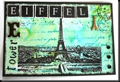
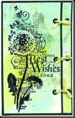
Embossed, with eyelets.
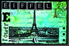
This is a scan.
Labels: Alphabet Swap
Wednesday, 25 August 2010
Wow – Wednesday already!! How did that happen and where’ve the last few days gone to????
Labels: WOYWW
Tuesday, 24 August 2010
Let’s Ink it Up #1 – Anything Goes - with a Twist
28 very kind comments from lovely people at Tuesday, August 24, 2010Labels: GRID TECHNIQUE, Techniques
Woohoo! I made Ginger Gem again!
10 very kind comments from lovely people at Tuesday, August 24, 2010Labels: Award
Monday, 23 August 2010
Crafty Cardmakers’ Challenge 28 – Video Inspiration – DT example
15 very kind comments from lovely people at Monday, August 23, 2010The theme for this week’s Crafty Cardmakers is a Lady Gaga Video.
See stills on the Crafty Cardmakers website if you prefer not to watch the video – definitely not my cup of tea, lol!
From the video, I focused on silver, white, diamonds and bling but also on the part where she looks in a mirror, which is why the frame is there.
I stamped the image (Time to Stamp Glamour Girls) in Brilliance Starlite Silver on Glossy card, then cut to fit the frame (Life’s Journey from K&Co). The background is stamped with a Kars’ Harlequin Background, then heat embossed with a Silver/White sparkle Embossing powder.
The silver mesh (from my stash) was attached with a bit of double sided carpet tape (Wilko special, lol) behind the frame, then with 6 silver square brads – 3 at top left, 3 at bottom right – turned to look like diamonds. I didn’t want it to be firmly attached.
The word ‘Divine’ was from the same stamp plate and was stamped and embossed with Fine silver Embossing powder, then layered onto silver mirror card.
Wire embellishment (Woodware) was attached with Glossy Accents and after attaching the stamped layer to a piece of silver mirror card, then to a folded white card, I attached the frame to the front – again with super strong Double sided carpet tape, to keep it secure.
The prize for this week is approx £10 worth of Die cuts from
We’d love to see you take part this week.
Thanks for looking.
Saturday, 21 August 2010
After struggling with a DT project which was way outside of my comfort zone, I decided to play for a little while this afternoon – just because!! Happily, the colours I used (which are some of my favourites) just happened to fit into this week’s Playdate Café Challenge, which is this colour scheme.
It doesn’t look quite straight, but it is – it looks that way because I mounted the top layer onto thick foam tape for a change – the scanner has obviously struggled with the 3D effect.
All Tim Holtz (Stampers Anonymous) stamps, with Distress inks in Tumbled Glass, Bundled Sage and Stormy Skies, then some Adirondack Pool added.
This is another scrapling I made quickly, yesterday.
Thursday, 19 August 2010
Just had a couple of hours to play, so I made some backgrounds with Ecoline inks – watercolour paints. I just used a pipette to put a few drops of red and yellow on a non-stick craft mat, then spritzed with water and picked up the colour with some white card.
Then stamped the Paperartsy image (and clear embossed) and the Hero Arts Friends stamp (using Wild Honey Distress ink). The words are from various stamp sets and are all clear embossed.
Theme Thursday challenge for this week is Children.
Gingersnap have a red, yellow and orange challenge but they also have a Paint challenge, so this fits both.
Rainbow Lady’s Challenge for this week is ‘Paint it’
Don’t think I’ve ever entered a card for so many challenges in one go – quite coincidental, lol.
(I’ve changed the image to a photo because the scan made it look more ochre than orange and it was WAY too bright!)
Wednesday, 18 August 2010
What’s on Your Workdesk? Wednesday 63
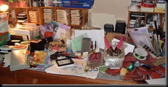
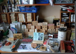
38 very kind comments from lovely people at Wednesday, August 18, 2010It’s been one of those weeks and here’s the proof in all its glory. NOT a very tidy desk this week at all – in fact, it’s as it very often is, lol.
I made a few things really quickly, one after the other, and have been out nearly every day with John, so I left it as it was when I finished, without moving a thing or cleaning a stamp and haven’t touched it since.
Now you see the chaos I really work in, he, he. I did proudly display my latest creations in my beautiful WOYWW easel, though – you can see it, honestly, if you look VERY closely – he, he. You can also see a card front I got from Vix yesterday – lovely colours – and I like those stamps – ooh, disaster!
I should probably be ashamed, but guess what? I’m not, really. I nearly always end up working this way, hunting for bits to use beforehand so that I have things to choose from and I rarely have more than this amount of space to work in – unless it’s something bigger, lol. Even if I start with a totally tidy and clear desk (which is rare) it ends up looking like this. It’s probably going to get worse before it gets better cos I won’t have time to tidy it but NEED to stamp soon or I’ll go nuts! It won’t take me long to tidy that lot up when I’m ready. Every item has its own home to go to. If only you could see the floor…
Tuesday, 17 August 2010
For those of you who were asking about the Red Kites, you can see my far from perfect attempts at photography here. It will give you some idea of the size and majesty of them. (I keep anything non art related off this blog, so as not to bore people, lol) I just saw some of John’s photos and although he’s complaining about the few he hasn’t deleted, I think they’re great. I’ll upload them when I get hold of them.
Monday, 16 August 2010
Here’s my DT sample for this week’s Crafty Cardmakers’ Challenge Spotlight, which this week is the Spotlight Technique.
Labels: CRAFTY CARDMAKERS CHALLENGE
Offcuts and Eyelets – KCUK Challenge
14 very kind comments from lovely people at Monday, August 16, 2010This month’s Stamping challenge on KCUK is Offcuts and Eyelets, so when I read about ‘Scraplings’ on the Gingersnap site, I thought it would tie in nicely.
Here are two quick samples I made to try them out.
They’re a great way to use up your card offcuts, especially when you’ve cut a folded A4 card to get a square! They’d make lovely little thank yous or ‘calling cards’. I’ll play some more when I get time but now I’m off to see some Red Kites – hopefully – while the weather’s good!
Sunday, 15 August 2010
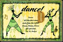
Back to the Alphabet Postcards and here’s my D – D for Dance and for Diamonds. Really not what I had intended but sometimes something comes into your head and you just have to go with it, even if it’s not really very ‘you’, lol. This was one of those times.
It’s not often I paper piece, but this time I did because I didn’t want to mask the dancers – they would have been really awkward images to cut out and I just don’t have the patience, so I cut the clothing from a patterned paper. The outside border is sheet music, torn into strips, the harlequin background (Kars) is stamped in Adirondack Lemonade and Juniper on a Lemonade sponged background and the images are from Time to Stamp.
Saturday, 14 August 2010
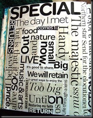
Messing about with Typography – inspired by Sue and Michelle
23 very kind comments from lovely people at Saturday, August 14, 2010I was reading Sue Roddis’ blog the other day and noticed this post, inspired by Michelle Ward’s Crusade 43 Challenge and I just had to try it, I liked it so much.
Basically, you just tear or cut out bits of headlines from newspapers and/or magazines. Mine were snaffled from the Radio Times and a Sky Mag, both hanging around. I haven’t done anything with the pages yet but I will – I just wanted to record the pages as they looked before they were completed because I like them :D
Labels: GPP Street Crusades
Friday, 13 August 2010
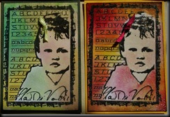
I made these backgrounds last week, when playing with Brilliance reinkers, so these were very quick cards, but fun to make. I think I like these words, he, he.
For those of you who asked how to create these backgrounds, here are the instructions.
It really is very simple but gives you some fab, quick and easy backgrounds. Just squirt bits of Brilliance reinker onto a non stick Craft Mat, then spritz with water. Brilliance is a little more viscous than standard water based inks, so stay thick and tend not to blend in the same way and the colours remain vivid. Just mop up the inks with cardstock (matte or glossy – totally different results, as you can see – glossy tends to be a little more muted because the colours move more on its surface) and let them dry. If you pick up a lot on one piece of card, ie if the ink is a bit thick, just spritz again with water, lay another piece over the top and pull off to get some fab effects on both pieces. You can twist it as you take it off if you want to get swirly patterns. It's cool because Brilliance is so shimmery to begin with that you get all the effects of shimmer sprays. Don’t worry if you get some white bits, either – they add to the effect. Oh – and this works on black glossy cardstock and acetate and lots of other surfaces, too!
Labels: Brilliance Reinker Technique, How to
Thursday, 12 August 2010
I enjoyed playing with the PDCC colours (see post below) so I did another one, hoping the colours would be a little truer – unfortunately, the green is a tad too dark this time. Can’t win, lol.
But I do like this design ;)
I used Brilliance Pearlescent Beige this time and at least the beige is more accurate. Might enter this one, too, although I’m not sure if we’re allowed multiple entries?
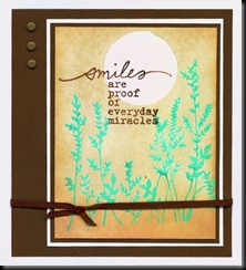
PDCC 42 – Brown, Beige and Green
18 very kind comments from lovely people at Thursday, August 12, 2010I missed playing with PDCC last week, so when I saw today’s challenge, I had to play along.
Here are the challenge colours.
Here’s my attempt.
My beige isn’t quite as beige as I’d hoped and my green’s a few shades out, but never mind. I stamped the grasses with Fabrico (now Versacraft) Mint Green ink, then clear embossed them. Added a sun/moon mask, then sponged over the whole card with Versamagic Wheat (adding a little Pumpkin to edges and bottom). Finally, I stamped the words in Versafine Vintage Sepia and embossed .
Wednesday, 11 August 2010
Here we are again – another Wednesday, so it must be the fabulous Ms Dunnit’s WOYWW!!!
I’m afraid I’d had a really messy session with acrylics and sponges and tidied up a bit before I took this photo – shame on me, lol. BUT it’s still very active and not over tidy, despite the fact that my other half has booked a few weeks off work, so we’re going chasing photos here there and everywhere, when the weather allows – AND it’s because I needed the space to do something else – not because i wanted to tidy up specifically for the photo.
NOT that the glorious North West of England allows very much when it comes to good weather – in fact, we’ve hardly seen the sun for over 5 weeks now. It’s been grey, dismal and even cold at times since June!!! It CAN be a little frustrating when I read the Southern and Eastern girls’ blogs, saying how hot they’ve been – sigh!!! So we’ve also been over to Wales, chasing the sun when they’re lucky enough to have it – not too far from us, though so not difficult.
Anyway, here’s my semi tidied desk (which means sponges under desk, acrylics thrown in box behind me and scratch paper assigned to bin) with lots of stuff in progress.
Ma Vinci’s humongous alphabet stamps are out there in their bag- for my alphabet pages and postcards but also for some personal journalling I’ve been doing. If you look closely, you’ll also see Saturday’s Stamp Club project, half completed because I want to modify it a bit before I carry on. It’s a fab concertina envelope book, taught by the lovely Gill, who doesn’t blog YET.
In my WOYWW easel is an old vintage card I made about 5 years ago – out because it’s a reminder of something for another project I’m intending to make. There are also stamps for a DT project I have to make this week and some backgrounds and stamps, waiting to be put together, including the acrylic stuff I was playing with. If you look carefully, you’ll see the punchinella (sequin waste) peeping from the open drawer – I use that a lot to fill in and to do edges of pages and backgrounds, so there’s always a piece around, along with other bits of mesh and ribbon I use for the same thing.
I’ll be out early tomorrow, so I’m scheduling this cos we’re off chasing steam trains again, then perhaps on to see some Red Kites, although that may have to wait until later in the week, depending on other things.
If you wanna join the rest of us and
Labels: WOYWW
Tuesday, 10 August 2010
The theme at Think Monday, Think ATC this week is Communication.
Saturday, 7 August 2010
Change of style… and Wednesday Stamper
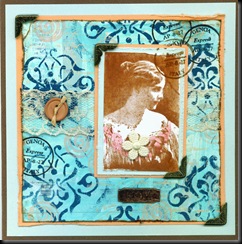
30 very kind comments from lovely people at Saturday, August 07, 2010Today, I felt like a big change, so this morning, I attempted a card made by Michelle Zindorf – not very successfully - but it’s gone in the post, today, to someone for a special reason. It was fun to try.
It’s a long time since I’ve done any vintage work and I really enjoyed this for a change. VERY messy, though and I think I’d better tidy my desk before the next WOYWW, lol, not to mention getting my stuff together for today’s Stamp Club.
This also fits today’s Lots to Do Challenge, which is ribbons (there’s ribbon in the button) and lace, but I may well do another one to fit the challenge cos this is a bit of a cheat.
Wednesday, 4 August 2010
D for Dreams and E for Elephant – KCUK chunky pages
24 very kind comments from lovely people at Wednesday, August 04, 2010Labels: Alphabet Swap, KCUK
Here we are again on Wednesday and WOYWW!!
Today’s my baby brother’s birthday, so Happy Birthday, Howard! I won’t see him cos he’s in New Zealand and has been for 10 years. I haven’t seen him for 7 years – sad.
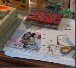
Back to WOYWW and here’s my mess for this week. It’s quite a creative mess this week – well, that’s my excuse and I’m sticking to it – lots going on and lots in the pipeline but in my defence, isn’t that how it SHOULD be?????
Labels: WOYWW
Tuesday, 3 August 2010
Labels: Alphabet Swap, KCUK
OFFCUTS AND EYELETS – KCUK AUGUST CHALLENGE
12 very kind comments from lovely people at Tuesday, August 03, 2010Labels: KCUK
B for … BOYZ (and Button Brads) OR BEEZ?
10 very kind comments from lovely people at Tuesday, August 03, 2010I had a bit of fun, making some backgrounds with alcohol inks, Perfect Pearls and Brilliance reinkers this afternoon, then I got carried away for a little while and made both of my ‘B’ page ideas for the KCUK Chunky Alphabet swap, without thinking – duh!
The background on B for Boyz and Button Brads is alcohol inks – Citrus and Pool with a bit of Wild Plum, Stonewashed and some gold mixative. Looks a bit washed out here, but that was the sun reflecting. (NO, I’m NOT lying – we DID have some sunshine for a couple of hours, honestly!!! Bit of a shock to the system, really, after all this greyness and drizzle.)
I can’t decide which page to use, now. IF I’d had any sense, I’d have done C for Children for the Boyz one, but guess what??? I er don’t have much sense, lol. Am tempted to ‘doctor’ it, though…
I also made another quick card with one of the Alcohol ink backgrounds that I fell in love with!
Labels: Alphabet Swap, KCUK
Monday, 2 August 2010
Crafty Cardmakers Challenge 26 - DT sample.
21 very kind comments from lovely people at Monday, August 02, 2010- 1. Use stickers or punches
- 2. Use the colour orange or yellow
- 3. Include and animal or fish
This card also fits the Gingersnap Challenge, Red, Yellow and Orange – in a slightly different way, but it fits.
Labels: CRAFTY CARDMAKERS CHALLENGE
Sunday, 1 August 2010
Over at Lots to Do, the Challenge this week is scenic route – not sure about the route but it’s definitely scenic, lol.
I was playing with my friend’s Silkies and made a cool background which is perfect for this stamp. I just stamped and embossed the Stampscapes image and the words, then highlighted the rocks and water with white pen. Nice, quick and easy.
Must say here (although I probably shouldn’t…) that I wouldn’t buy Silkies cos I don’t think they’re worth the money. They’re water based pearly paints, which come in a little nail polish like bottle, with a brush. The background was made by putting a few colours on a craft mat, spritzing with water, then brayering. They DO give a lovely shimmer and dry very quickly and I do like the colours but there’s very little in each bottle and I don’t think they’re all that easy to use. Just my humble opinion, lol.


