Friday, 9 March 2012
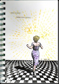
Michelle Ward’s final GPP challenge is ‘A Restraining Order’.
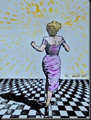
If you follow my blog regularly, you’ll know I love backgrounds. That means that minimalism is NOT my forté but this page has been in my head for a couple of weeks – well, ever since I got the larger version of running Marilyn, that is!
I used stamps from Lost Coast and Viva Las Vegas with a stencil and words from an old (outdated) French dictionary. I have to say that I find ‘white space’ in a journal VERY challenging.
Although I haven’t been able to take part in the GPP team challenges very often, I’ve found them really inspiring and very challenging and am very grateful to Michelle for the inspiration – not to mention for her own wonderful artwork. I fell in love with her work when I first saw the images she created for Stampington and was over the moon to discover her blog. Thanks, Michelle.
xxx


33 very kind comments from lovely people:
Wow Cath that is different for you but what a fabulous page !
Have a great weekend :)
Von x♥x
I like that page very much...and yes I have not got to the point of minimal in a journal yet either doubt if I ever will!! LOL
xoxo Sioux
Cath, it's hard isn't it? To stop? Thanks for sharing your page - love hearing that it had been in your head. Bravo for making it happen, and for practicing restraint. As you know I'm not saying less is better, just a different approach to composition. I really like the impact that the stark pattern makes, and with less on the page I can really appreciate the application of the stencil. Thanks for taking part in our community!
It looks really cool and that floor...!
Beautiful, a stunning composition, the stamping is perfect, love the chequered floor. Another who struggles with minimalist, I am rather too messy and usually need to cover up a random ink smudge somewhere LOL. XX
A wonderful page, Cath. I'm glad I'm not the only one who finds it hard but in your case it certainly does not show.
Wow Cath this is stunning, very different from your usual stuff, but then again a change is as good as a rest.
Sam xxx
Wow what a stunning page Cath.
Extraordinary work. Love them.
Have a lovely weekend. xoxo
What a fabulous and stunning page Cath. So super beautiful. Love the layout and composition.
Lovely greet
Marja
What a great AJ page!!! I really like the running lady and the floor...the whole composition is so nice!
greetings and a great weekend, Alie :-)
wow its brilliant, loving the whole arty look of it. Enjoy the weekend, Annette x
Oh, you've really done it, here! I think you've 'minimalized' just the right parts! It really draws a viewer in.
Yeah, it's quite fabulous to find an artist like Michelle, and then be treated to her work on her website, too! It's like St. Patrick's Day every day!
I like this work. Thanks for joining in!
This is stunning - it's fresh and clean and works so well. I love the images - the floor is fabulous - great job stopping when you did - it's perfect!
What a marvellous page! I love it - the colour combo, too ...
Suzanne
Absolutley amazing! I love it. The floor she is running is brilliant!
Wow, Cath! That is fabulous. It might feel a bit strange but it looks brilliant! Great to have a change now and again -Don't stop doing your usual pages though - you have such a gift with colour
This is amazing Cath, it really has the WOW factor. I can look at this and think 'perfect', but then still have to throw the kitchen sink at everything I make lol. There is nothing so scary as white space! x
Nice. My eye seems to go to the 'minimal' one in a random group of pictures. I might have to try this challenge. You have inspired me. A
O I really like this ! great job !!!
darlene
Love it!
I like this a lot Cath - great image.
xxx Hazel.
Fabulous page, love the Marilyn walk away stamp.
Very striking image, I really like it. And the sentiment is one I can relate to a bit.
Oh, how cool is this!?!? Was drawn to the floor and shadow and then I saw your cool yellow stripes and the words.... LOVE it!
Wow, it's so striking, I really like it. There are so many places for our imaginations to go with it, that makes it a lot of fun. I'm realizing I like the mystery of more restrained pieces, and this is a perfect example. Great job!
This is really great. For me is white space really keep white a difficult job... respect!
I totally love this page!
Its stunning.... great colours it really makes an impact.
Love that she is running towards the empty space, the unknown; well done on keeping it minimal.
Wow ! I think you used the white space unbelievably well in this piece ! It is awesome !
I haven't done a Crusade in a long time but it has been great to revisit them for this last one and see what all the great artists who participate are up to.
Here's to a creative life !
Cheers !
You made awesome use of the white space challenge ! This pices is very cool !
I haven't done a Crusade in a long time but it has been great to see what all these taelnted artists are up to !
Here's to a creative life.
Cheers !
I always enjoy my "end of month, and the newspaper's finished blog cruise 'n comment" time. It's been lovely to meet you and your work via the Crusades. Thanks for sharing what you do with everyone. May the rest of 2012 be filled with creative happiness for you.
Wow this is beautiful. I love the colors in it, and also the subtle text. Very cool, very restrained! Thanks for sharing your Crusade. Best wishes, tj
Brilliant art work! Love the stamps and that "empty" background!!! Beautiful...
Post a Comment