Sunday, 29 November 2009
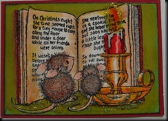
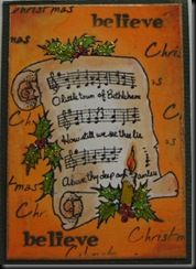
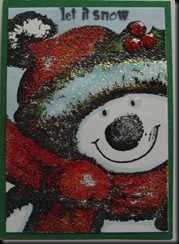
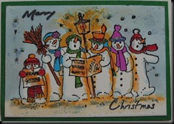
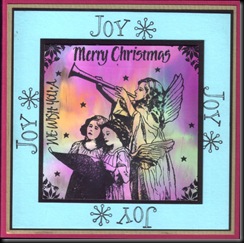
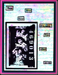
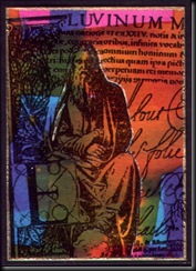
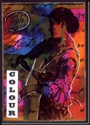
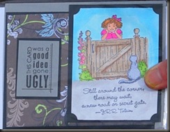
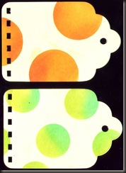
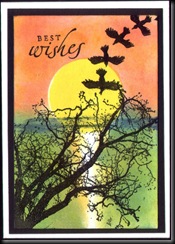
I know I should have waited for the Stickles and Glossy Accents to dry cos they’ll look much better, but I’m impatient and don’t have a lot of time today…
Forgot to say I used Promarkers on all of them.
Friday, 27 November 2009
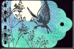
Non Christmas stamp Christmas – Blue and White
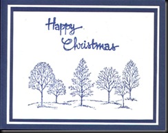
6 very kind comments from lovely people at Friday, November 27, 2009This month’s KCUK Challenge is to make a Christmas card in Blue and White from a non Christmas stamp… I’ve just made these :)
Thursday, 26 November 2009
This really does look MUCH nicer in the flesh – I used Gold Mixative with the alcohol inks (the yellow bits) and it’s really shimmery :)
Labels: christmas
Ooh, just had a fab half hour playing with Sharpies and alcohol – err, hiccup, hiccup, hiccup :) Only kidding – not the kind to drink – not yet anyway, lol.
I saw this technique somewhere - sorry I can’t remember where cos I hate it when people don’t credit the source! I’ll edit if I find it again. Anyway, I just fancied a go for a break from Maths (yuk!).
You just scribble on a non stick mat with various colours of Sharpie (or any alcohol based marker – try ‘P’ off pens or Permanent white board markers if you have them) then spray with alcohol (Isopropyl) and quickly lay something glossy in it, before it dries. You can get two if you hurry. I used glossy paper, so the colours are probably a little more muted than if it was hi gloss card but I’m in a muted mood after all that bright colour :) Here are my results.
These last two are my favourites. I used the same three colours I used on the bright coloured sheets a few weeks ago – magenta, turquoise and yellow. I know I said they’re muted but you can see the colours a little more than in these pics and while there is some white still showing, there’s very little of it, despite how the scans look
Labels: How to
Tuesday, 24 November 2009
While getting out my Christmas stamps (ooh-er – scary!!!) I noticed that I have a couple of these Simple Expression plates left, so I thought I’d do a seasonal giveaway :)
it will include the A5 unmounted Simple Expressions plate below, a fab Bradletz pack in Carnival colours (perfect for Christmas and LOTS of brads) and 12 Colorbox Pigment ink Cat’s eyes in the following colours:- Marigold, Chianti, Burnt Copper, Copper, Cocoa, Frost White, Cream White, Dusty Plum, Roussillon, Chestnut, Violet and Midnight. These are, of course all brand new. If you haven’t used pigment ink much, you really should – it’s such a treat because it blends so easily, you can emboss it easily AND – unlike water based dye inks - it’s permanent! PLUS, you’ll also get another surprise gift… a nice one :)
If you’d like the chance to win, just post a comment here on the blog . If you’re a follower, please remind me of it in your comment and you’ll get two entries, instead of one. You can leave comments until the end of November.
IDEA FOR USING ONE OF THE STAMPS
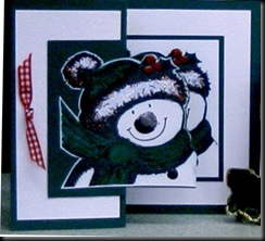
I haven’t had any time to stamp for a while (boohoo!!) so this isn’t a new card but since this image is part of the Blog Candy I thought I’d post instructions for making it. This was pre Cuttlebug folders and I can’t help but imagine how much nicer that plain background would be if it was embossed with the dotty folder….
Card upright
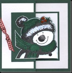
Card flat.
These really and truly ARE the same card - one scanned and one photographed - just goes to show how much difference a bit of light makes - the photo was taken in lots of light!
Before we start, you’ll need two squares (or rectangles) of coloured card to attach the images to, but they must both be exactly the same size. You’ll also need two pieces of card for the image – again, both exactly the same size. If If you’re going to add layers, as I did (it makes the card a little more robust) then you’ll also need two pieces of card which fit inside one side of the card, leaving a border all the way round AND two pieces half their width for behind the image and the inside greeting.
1 Take the two equal sized pieces of white card and stamp the snowman (or any image) as centrally as you can on both pieces. Colour with pens or your favourite colouring method. Don’t forget to add a fine line of pale blue/grey all around the inside of the snowman. It’s barely visible, but it really does make the image ‘pop’ and gives the illusion of snow. Attach one of the images to a square of coloured card.
3 Trim closely around the other image, leaving a fine white border all around. Attach this to the other square of coloured card, positioning carefully until it is in exactly the same position as the other image. Find the centre of the coloured card (top and bottom) and mark with a pencil, then cut around the right hand edges of the front image, leaving the left hand side intact and a fine edge of coloured card visible around the image.
4 This one’s only for the snowman, but if you’re using him or one like him, add Stickles to the hat brim and the bobble, then Glossy Accents to the coal nose and button and set aside to dry.
5 If you’re lucky enough to have a Scor-it, the next bit is really easy – just find the centre of the front of the folded card, score and fold back to the front side edge. If you don’t have a Scor-it, it’s still pretty easy :)
6 If you’re using them, centre one of the larger squares of white card on the inside of the coloured card and attach a white rectangle to the folded back part of the card which can be seen from the front.
8 When you open the card up, there’s now only half a front on the left hand side; stamp the greeting on another white rectangle and attach to this bit.
9 When dry, attach the first image on green card to the centre of the inside of the card. Folding the card, carefully line up the green card behind the cut out image with the one you just attached to the inside, then attach to the folded back front of the card. The image on the front of the card should cover the one on the inside if you do this right. When the card is open, you can see a bit of both images (see above) but it looks like one of those fab 3D cards.
These instructions make it sound really complicated but it isn’t – it’s easy peasy and one of those design ideas you’ll use over and over again once you’ve tried it because it looks as if you’ve spent ages on it, when you really, really haven’t. If anyone needs card measurements, I’ll be happy to provide them to make that first attempt really easy!
The card above was made by my good friend, Lynne – she stamped the snowmen on white Shrink plastic, coloured and heated to shrink. The central image is actually a ‘pin’ or brooch, so it’s a card AND a small gift!
Labels: Blog Candy, christmas, Projects
Wednesday, 18 November 2009
This is one of my favourite card designs and one I have (very rare for me) repeated many times because I love it so much. I needed a card to send for something special.
I really love this Vitality stamp!
You’d think I’d have this design ‘off pat’ by now, but no – I stamped the flower (using felt tip pens) then it took me 8 – yes EIGHT attempts to get the wording right – it kept smudging, then I smudged it while cutting the card – unbelievable!!!!!
This is a quick card, made to accompany something else – made from one of the scratch papers I use to protect the desk when I’m stamping and inking. The stamp is a new one – a gift – so of course I had to try it out :) Thank you, Mel!!
Labels: Scratch paper Challenge
Thursday, 12 November 2009
This is how the covers ended up – and I’m half way through punching and binding – only with ‘O’ rings, but I’ve used the Bind it all, so anyone who wishes to can just finish the book off with a coil :)
It’s hard work but it really is a privilege to compile these books. The idea came from Suse and I’m sure she would have loved them. There’s some fab artwork!
Wednesday, 11 November 2009
Skinny Pages Completed – well, almost…
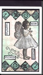
1 very kind comments from lovely people at Wednesday, November 11, 2009Here are my completed (? almost) pages for the Skinny Book Swap. I need to mount them on the actual covers and attach the words (in progress – my trusty Xyron has come out of hiding) but these are the actual skinnies :) I sprayed with Glimmer Mists before attaching the little girl and the coloured borders, but of course you can't see that - nor the glitter on the little girl...
Labels: Skinny
Sunday, 8 November 2009
Colour ATC Technique – as requested :)
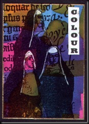
8 very kind comments from lovely people at Sunday, November 08, 2009I feel more than a little embarrassed about posting this as a technique because it really is so EASY, but here you go…
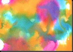
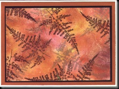
I used just three shades of Ecoline inks – Cerise, Cyan and Yellow – then, taking a sheet of card (thickish) or watercolour paper (I used hot press smooth) I just painted them on randomly (with thick brushes) and left them to dry. What a cheat? The colours blend beautifully and create all those shades you can see on the ATCs. On some, I wet the card or paper first, then added the inks, on others I spritzed after painting, then mopped up excess colour with another sheet of card/paper, so I ended up with lots of variations – some muddier looking than others, some paler.
Word of warning – it looks YUKKY before you stamp it and the white highlighting really does make all the difference :)
I did try this with Adirondack reinkers but they are too highly pigmented, so the colours are too dark. Great for inkpads but not for techniques like this. I am intending trying the same thing with Vivid Reinkers because I have quite a lot of those – I’ll upload my results when I do.
Here are a couple of the backgrounds BS (Before Stamping).
I think the first two were spritzed VERY lightly. Don’t they look YUKKY?
The second two pieces were wet before I started and then were spritzed a little more before being allowed to dry. These look much nicer unstamped.
Labels: How to, Riot of colour, Techniques
Saturday, 7 November 2009
The Ugly Card is on the move and needs a new home…
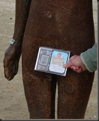
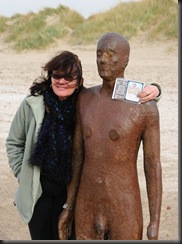
10 very kind comments from lovely people at Saturday, November 07, 2009This is it in all its glory (forgive my INKY THUMB – yes, that’s INK!) on its day out in Merseyside. We took the not so ‘Ugly Card’ to Crosby, North Liverpool to see Antony Gormley’s ‘Another Place’ exhibition of 100 ‘tin men’ scattered along 3km of coastline, along the River Mersey Estuary, looking out at the Irish Sea.
According to Antony Gormley, ‘Another Place harnesses the ebb and flow of the tide to explore man's relationship with nature. He explains: The seaside is a good place to do this. Here time is tested by tide, architecture by the elements and the prevalence of sky seems to question the earth's substance. In this work human life is tested against planetary time. This sculpture exposes to light and time the nakedness of a particular and peculiar body. It is no hero, no ideal, just the industrially reproduced body of a middle-aged man trying to remain standing and trying to breathe, facing a horizon busy with ships moving materials and manufactured things around the planet.’
It was a windy day and we felt sorry for our ‘Tin Man’ so we covered his ‘bits!’
But I decided I’d like a more ‘intimate photo’ so here it is – complete with wind blown hair!
The Ugly card has travelled a long way, starting life in Canada, then moving from country to country and city to city – since it’s now in Merseyside (arriving from Yorkshire) it’s looking to go a little farther afield now. If you can offer it a temporary home and a day out ‘of interest’ then please leave a message on my Blog – I’ll draw names out of a hat…
I should have said; the card came to me from Sylvia Anne and originated from Diane Forst in Canada, it then went to Tracy, also in Canada, then it went to Jen in Hawaii, who sent it to Rita in Massachusetts. Rita sent it to Lyn, and Lyn passed the card to Sylvia in Leeds, West Yorkshire, who passed it to me in Merseyside (not quite Liverpool, even though the photos were taken in Liverpool.)
I'll leave this post at the top of the Blog for a few days, until I have chosen a new owner!
Labels: The Ugly Card
Friday, 6 November 2009
Brazen Brilliance and Triple Resist Technique
4 very kind comments from lovely people at Friday, November 06, 2009These cards are unfinished – they’re just background to show the effect of the technique. the lighter colours you see in the scans don’t show up unless you tilt the card, giving a gorgeous multi layer appearance. The pearly Brilliance inks just make it that little bit more special. I’ll try to do another sample of this later on if I find time.
This last one is a Triple Resist Technique – stamped with Versamark ink, then brayered, ink removed then stamped with Versamark again, followed by brayering in another colour and finally, overstamped with yet another shade of ink, giving three shades altogether.
Labels: Brazen Brilliance, Techniques, Triple Resist
Thursday, 5 November 2009
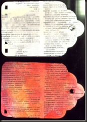
Here are some BI (before ink) and AI (after ink) samples.
The first one is peeled paper – though it doesn’t show up very well. They don’t make Sellotape like they used to… lol!
This one’s just Gesso, applied randomly – hard to see it on the top tag - sorry.
Next we have gesso on torn book pages. You can really see the faux texture on the second tag.
Labels: Gesso, Peeled Paper, Techniques
Using punches (or die cut machines – or even scissors or craft knives) to create a ‘stencil’.
Creative masking BS (Before Stamping) and AS (After Stamping) :)
More Creative Masking
This one is courtesy of my Mum, Jan Cross - her card was based on an advert on the back of a bus in New Zealand and used Pampas grass or wheat in the foreground.
I’ve already posted this (but will remove it from former post) because it, too is made by creative masking – using the humble post it note :)
Labels: Creative Masking, Techniques


