Friday, 15 January 2010
Well, here are the disasters – or most of them. I think there must be a Black ink Bermuda Triangle in this house cos I can’t find a Memories, a Memories reinker (found a blank pad) OR a Versamagic Black! Need to restock, I think I’ve given them away…
Anyway, I digress – sorry :( I listened to your advice and here’s what happened.

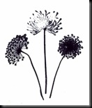
Newly reinked Brilliance Ink on Glossy
Adirondack Pigment ink on matte card, then on glossy. This one turned out well.
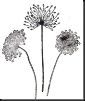
Adirondack Pigment ink on Watercolour paper. I held the stamps to the paper for a while, to let the inks transfer but it isn’t perfect.
Versafine on Watercolour paper – granted a little more difficult to stamp because of the paint.
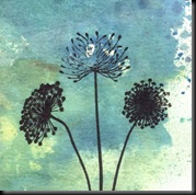
Colorbox Crafter’s Ink over Alcohol inks on Glossy card.
I think this one and the Pigment ink are actually my favourites, even if this one isn’t absolutely perfect – the other one I did was better. The only problem is it’s VERY matte and I wanted a glossy finish. Need to experiment more…
Labels: EXPERIMENTS


8 very kind comments from lovely people:
Hi Cath. I find Versafine or Versamagic work well with clear stamps (or any stamp for that matter! They're my two favourite inks.) This may be stating the obvious, but it's worth making sure your clear stamp is really clean before you ink it up. Any little greasy spots, eg. finger prints, will not take the ink. Also, have you tried using a brayer to apply the ink, as it may give a more even coverage? If all else fails, though, like others have mentioned I will resort to going over the image with a Sharpie or Promarker!
I do like clear stamps, mainly because you can so easily see where you're stamping with them, but also because as you say, there are so many beautiful designs.
Hi, have you tried dusting your card with an anti static cloth first it may make the difference worth a try ju x
I admire you for all your research, they all look nice to me. I will let you finish your experiments - then go and buy the ink pads
Naughty I know!
That's really helpful. Thanks for letting us see your experimenting!
Lesley x
Great to see all the experiements and work in progress. You are my "go to" when it comes to any advice about inks. What you don't know about inks aint worth knowing as they say haha & its true. Love seeing your work on here. Px
Blimey, you've got so many black inks, I only have two, maybe that's why I struggle.
Thanks for sharing all these, they all look fine to me but I love the effect on the watercolour paper.
Lisax
I am experimenting also sometimes... i prefer versafine black ink and the clear embossingpowder over it gives a clear detail.But I guess different people like different things,thats the whole fun about it!
Thanks for sharing your info Katy.
i love this idea - i really have no clue what ink is best for my stamping projects, so thank you for showing the different effects!
Post a Comment