Good Morning!
Just sharing an offshoot from my challenge card for the current New Technique Challenge at Try it on Tuesday
Before I decided to do a 'full front' card, I had originally intended to do this design... again using Red, Yellow and Blue inks, but this time through an Ink Blot Stencil. After spritzing with water and allowing to dry, I realised it wouldn't work with a sentiment and I wasn't happy with the amount of blending... my 'ink blots' weren't quite close enough to create the effect I was after.
This was the one I was hoping to use my alphabet dies (YES, I'm still hunting for my 'T'!) on it. They would've been the perfect size. I could still have used them with lower case dies, but because my original plan was foiled, I changed tack. I was still left with this one, however and it was too 'interesting' to waste, so I simply added a white die cut Happy Birthday and did a little 'happy spattering' with all three primary colours. This one was made with Distress Inks, not Oxides. I love the blending, even though it didn't work out quite as well as the one I chose to use.

It makes a great card for a man - or boy - quite versatile - with or without the hearts 😉 or stars or whatever you choose to add...
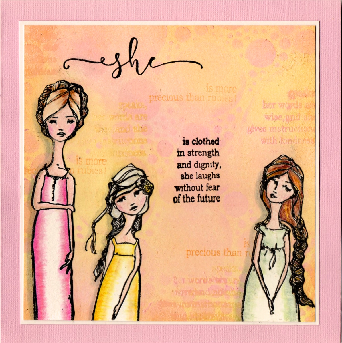
I made this one for a very precious friend who's having a bit of a hard time...I wanted to remind her that she is a Proverbs 31 woman 😊
It's now been delivered so I can share it.
The background is Versamagic inks - nice and chalky. I am determined to use more of my stash and I don't think there are any really pale inks as good as these...I knew it had to be a pastel background. The girls are lightly coloured with Prismas.
Thank you for calling in today
Back soon
Cath
xxx


14 very kind comments from lovely people:
Both beautiful. I love the artsy feel to the first and the calming effect of the second. Your pale BG is gorgeous and those gals are so peaceful.
Wow they're great and very different, that background of the first one is awesome with those rich colours and the pastel tones of the second one are beautiful. María, xx
Super artsy ! I love your style!!!
I actually like this card better than the one with the full length of stripes. This seems to have more class. Maybe because of the added white space, or maybe because art is SO subjective. Regardless, this is a great card and I love it dearly.
I also like the one for a woman. That's a beautiful card and quote. You stamp SO well!!!
Cath these are both so different equally beautiful. A really fun, modern card with bold colours that I love, and then a really elegant one. Well done you! Take care and have a very happy March, Sue xx
Great cards, love the colourful inky background, it's perfect with the white sentiment. Your other card is gorgeous too,one I'm sure your friend will love. Thankyou for playing along at Seize the Birthday, Cathy x
Fabulous result even though not what you planned love the background-beautiful card for your friend I love the images and great background
Carol x
OOhh How happy are your cards Cath !! Really amazing both. love the so bright colours of your first one, and the lovely background of the second, with girls. Great sentiment.
I wish you a very nice Sunday, and send big hugs,
Caty
Love the inky background to the HB -- fun card. Thanks for joining in at STB
Beautiful cards! I love how your inks have blended and your feminine card is gorgeous 😁. I'm sure your friend will love it, wishing her well and have a wonderful new week! Hugs, Jo x
great looking cards...the rainbow one is so happy and could work for a man or woman...so happy.
xx Karen
Hi Cath, two wonderful cards. I love the distress ink rainbow you made, why don't mine stay that separated. I need more practice, I know. The second card is background fabulous. I've several small and large VersaMagic Chalk inks and I keep them in a Use It Up box. Some nice light colors I cannot stamp sentiments with nor shapes really - too light. I need to try a background with them. Thanks, you inspired me, XXO
I love those bright colours Cath! Your second card is a real beauty and has those lovely words too! Hugs, Chrisx
Scanning the photos down the side I don't see me again! Where have I been?
I love this first card - so bright and cheerful, perfect with the white diecut word over the top of the colour. What a good idea and so useful for so many occasions and definitely a nice easy one for a man. This is fab!
The other card is gentle and serene, again a lovely background. Why have I not thought of using my Chalks in this way? The figures are lovely but you haven't said who they are by. You do have some beautiful stamps Cath and these are perfect with the words you have used for your Proverbs friend.
God Bless, Neet xx
Post a Comment