'What you do speaks so loudly, I can't hear what you say.'
Ralph Waldo Emerson

Saturday, 2 May 2020

Hello!
I've had some great playtimes lately, but today I'm sharing a couple of simple Sympathy cards I made. Sadly, there seems to be much more need for these of late.
I used this gorgeous Penny Black stamp on both - it's one of my 'go to' simply stunning images that comes in handy for lots of occasions.
The first one is stamped on Kraft card and coloured with Prismas, with a little Stylo white gel pen highlighting and some Versamark shadow stamping behind it. .
My second uses a simple CAS background I had in my background basket, made ages ago. I coloured it in similar shades of Prisma. This is one of my CAS backdrops. It doesn't need much more than a flower or leaves to complete it but always looks good.

This one is one of the results of yesterday's playtime. I didn't use one of the backgrounds from my stash, but indulged myself in some time with Peacock Feathers, Shaded Lilac and Wilted Violet Oxides and stamps I've had for a while, but not used...I think I'll 3D them next time 😉 I coloured them with Acrylics, with a bit of touching up with Prismas. I think the stray green splotches must have come from my hand, when leaning on the card to colour 😁 but I quite like them.
Linking to
Sweet Stampin, Bright and Beautiful

Thanks for calling in
Back soon
Stay safe!
Cath
xxx

Wednesday, 29 April 2020

Hi there. It's AGES since I blogged...sorry... 
I have things to show you soon...😊 but I thought I'd share yesterday's playtime and a couple of older projects.
A little while ago I bought some thick (400gsm) card because I needed something sturdier for die cutting. When playing with an offcut one day, I noticed that the inks moved beautifully on it, especially when spritzing, so I used a piece for this Oxide background. I loved it. So yesterday I stamped it and coloured with Prisma pencils. The centre flower started as a paler lilac colour, but it was almost absorbed by the background, so I decided to change its colour to paler yellows. Because I'd coloured over the inks with Prismas, it was hard to cover the original colours, so I tried acrylic paints, then added some Prisma shading. I love these flowers and they are huge, so I'm planning something bigger with them in the next few days. 
The words stamp (Stampinback, I think) is one of my all time favourites.
You can see how beautifully the water splatters show up on this card.
I used Poscas for the little touches of colour. You can also see the darker shading beneath the flowers.

This one was a 'kickback' after working on something specific. I picked up an old background for it and added a little stencilling before stamping the flower and colouring. It's richer than it looks because I used gold spray on the background and some chestnut shades, too. Maybe I'll take a photo...

I made this one a while ago but didn't blog it for some reason. I stamped a lovely friend's (Stampotique) image a while ago and just added colour and the little bird which was the remainder of something else I'd been playing with, and just happened to be on my desk...this image always brings to mind Le Petit Prince, a lovely old allegorical French book, which is a favourite of my very special friend's. There are now 'Petit Prince' stamps, which I'm very tempted to splurge on at some point. 
The colours in the background create an ethereal look, though it's not so easy to see it in the scan - the words are embossed in silver, so show up better in real life..  the stars are stencilled, with a few tiny punchies thrown in. I just love the way inks mingle to create gorgeous colours like this. I'm so often surprised by the results of just throwing colour at a piece of card 😉 and seeing how they turn out.
I painted the moon with some glitter medium I bought about 20 years ago! I always love the effect it gives. The doodled borders were made with a silver Pilot rollerball pen.
I went for a walk around my yard earlier and was in awe of these gorgeous azaleas, so I thought I'd share a photo with you. It had just been raining, so you'll probably see water droplets, too. What a shame they'll soon disappear!

I'm linking to the following challenges:-
Tuesday Throwdown, Add a Doodle
Artistic Stampers, In the garden
Penny Black & More, Anything Goes
Watercooler Wednesday, Anything Goes
Addicted to Stamps & More, Make Your Mark

Well done if you made it so far...sorry it's a bit of a photo heavy post 😉

Stay safe everyone!
Thank you for calling in today
Back soon
Cath
xxx

Friday, 10 April 2020

Happy Good Friday! 
Today is the day we celebrate God's amazing love - and this year, today is also my very special friend's birthday! So now that she has her card, I can share it with you.

The background is sponged, smooshed and sprtized and dribbled and splattered, using Iced Spruce, Twisted Citron and Hickory Smoke Distress Oxides. The images are a roughly stamped and clear embossed Studio Light stamp, which I also stamped onto white card, coloured, fussy cut and glued over the stamped images. Splatters - which are hard to see - are Delicata Gold and Gold UTEE, sprinkled and embossed. Circles are jar lids, used as stamps. I really enjoyed making this one.


I made this Easter card yesterday, just to wish you all a Happy Easter. 
Spring is here, new life and growth are all around us. 
Celebrate the hope of Easter!
The flowers are stamped with spritzed markers, then defined a little with Prisma pencils.

Linking to 
Ellibelle's Crafty Wednesday, Bugs, Blossoms and/or Butterflies
Penny Black and More, Anything Goes
Simon Says Stamp Mondays, Add Texture (UTEE)
Watercooler Wednesday, All About Occasions
Artsy Stamper Challenge, Things with Wings
Make My Monday, Make Your Own Background Paper
Alphabet Challenge, Anything Goes

Thank you for calling in today
God bless you and keep you safe
Happy Easter!
Cath
xxx

Tuesday, 7 April 2020

...is the theme of this month's challenge on the Stamping Sensations blog. I'd just told someone I'd taken out my splatter stamp background, made last year with this gorgeous Inkylicious stamp, and it just happens to be a rainbow. So I just needed to find a suitable image and some words...these Lavinia geese seemed to work really well. They look to me as if they're searching for the rainbow and are now looking to see what the 'pot of gold' is! I love this image. I love rainbow backgrounds but it's always difficult to choose a suitable coloured card for them. This one worked well today.
The challenge over at My Inkie Fingers is Make it Pop. 
I made this card yesterday, using the newish Pink Ink flying pig stamp - it comes with dies, too, but I think they're pretty simple images to fussy cut. I stamped a couple of times and added foam tape to make the top ear and wing stand out - that seems to qualify for 'Make it Pop'!
I may just have to cut that border off because it's very limiting...I'm not a fan of square or rectangle borders on stamps. I did use the die cut for the words on this card, but won't in future. I don't really like  'cut around' words. It was fun to colour this, but until I cut off that border, I think I'll be using Miss Piggy on her own.
I'd also like to link to the Penny Black & More Anything Goes challenge.


I set a challenge for my FB group, last month - Flowers, to make it simple and here's one of the cads I made for it. I'm enjoying making backgrounds with the AAll and Create dotty stamp and stencil but I'm probably using them too much 😉

I love this flower and just ordered the larger ones, so I'll be journalling those in a day or two. It's really good not to feel bad about spending too much time stamping 😊😁
Also linking to
Make My Monday, Make your own background paper
Dragonfly Dreams, Add a flower/s
Sweet Stampin, Things with Wings
Paper Minutes, Make Someone Happy

Thank you for calling in today...
I'll be back soon
God bless you and keep you safe!
Cath
xxx

Saturday, 4 April 2020

That's the theme of our April Challenge at KCUK. We usually do monthly 'mingles' where we each send something we've made to one allotted person. This time we're going digital because mail is suspended to some countries.
This little Katzelcraft birdie was already coloured and sitting on my desk, waiting to be used. I found my bee stamps and when I saw the beehive, I suddenly thought he'd look good if he was looking up from his perch, seeing bees all around... the beehive looks as if it's floating 😉... I will use a wall or fence stamp next time, I think, but for now, I'll claim artistic licence. They must be bumble bees, looking at the size of them and the flutterbies are obviously babies, a last minute addition to include all three Bs. The branch is a die cut.

Another blossom card , too. I love this image but I seem to hit problems with the words every time I use it, lol. This time I decided to emboss in white EP, but it didn't emboss well, so I had to go over the words with a white gel pen... The words say, 'My soul sings as I stand in awe of the complete and utter beauty of nature.' I think it's an old Stampinback stamp and one of my favourites. I smooshed over the stamped flowers, then bleached out the colour, adding Prisma colour afterwards.
Linking to
Ellibelle's Crafty Wednesday Challenge, Bugs, Blooms and/or Butterflies

Thanks for calling in today
God bless you and keep you safe!
Cath
xxx

Tuesday, 31 March 2020

We have a great new challenge for you this time over at Try it on Tuesday.
The Beauty of Nature!
What better theme to concentrate on at this current time. 
As we all try to go about our everyday lives as best we can, separated from the people we love and the friends we 'do life; with, it's good to focus on the good things around us and the beauty and peace in them. Nature goes on and seasons change... and nothing stops that. I hope you're able to enjoy a little of that blessing, even though we're not allowed to spend much time outdoors. My bulbs are in full flower and more stunning every day...I thank God for that blessing! Focus on the good things and celebrate beauty instead of the fear and panic filling the News channels at the moment. Life may not be perfect but it's still good!

I decided to try something different this time, so I took a (sun)flower stencil and applied some ordinary, everyday filler paste that I'd bought to try out. I'm always disappointed with my stencil paste attempts but this worked wonderfully, although I did sand it down very gently to get it perfectly smooth.
I then added some Distress Oxides (Cracked Pistachio and Shaded Lilac, with a little Wilted Violet) to my work surface, sprayed with water and smooshed the card with them. Stamping some background texture with stamps complete my background. A little shading between the petals, using a grey brush pen, and a little Wilted Violet sponged  around their edges makes the flower stand out a little more, along with some white gel pen to highlight. I used my labeller to print 'The wonder of', then stamped and clear embossed the word Nature, to complete it. Adding the black and white layers just seemed to pull it all together and show off the beautiful pastel shades.
I took some photos as well because I was frustrated that the scan made it appear debossed, showing the flower in relief instead of standing out...it always does that with dry embossing, too. 
These are definitely my 'feel good' colours in all shades, though I usually add a touch of blue. I find them really calming and very peaceful. 

Please go look at the gorgeous art created by the team
It would be lovely to see your Nature themed artwork of any kind during the next two weeks, so please join us over at Try it on Tuesday. This is my last post as a member of the Design Team. It's been a great learning curve and has kept me focussing on art during some very difficult months, but it's time to leave. Thank you to all of you for being such wonderful teamies and a source of encouragement. You're appreciated. I'll still visit your blogs regularly and, who knows? I may well even join the challenges, lol!
It's especially important to to focus on the good things in our lives and to enjoy some therapeutic, mind absorbing art! 
Have fun and lose yourself in creating 😁

Edited PS
I walked into my craft room last night, when it was dark and yay! My fluo Prismas on the giraffe I coloured a few days ago were really, REALLY glowing in the dark...I am so impressed 😊😉

Linking to
A Place to Start, Unconventional Materials (filler paste)
Crafty Friends Challenge, Spring Colours
My Time to Craft, Off the Edge
Time Out, Lots or a little purple
Simon Says Stamp Mondays, Spring Moodboard

Thanks for calling in today
Back soon
God bless you and keep you safe!
Cath
xxx

Sunday, 29 March 2020

Good morning and Happy Sunday.
I'm currently trying to post a bit of art to KCUK most days, so here's today's offering - a bit of fun, using one of my favourite stamp sets. It's so easy to use and works well for a lot of Greetings - I've even used it for Christmas. Perfect for a man, too 😉

I'm linking this to
Allsorts Challenges, Men and Boys
Alphabet Challenge, Z is for Zoo Animals
Just Add Ink, Just Add 'E' - Elephant
Fun Friday, Cute Critters
Mix it Up Challenge, Anything Goes, optional smooshing (background smooshed)

Thank you for calling in today
Back soon
God bless and stay safe!
Cath
xxx

Friday, 27 March 2020

Just a quickie cos I'm VERY late with this...

The challenge on Allsorts Challenge is Any Animal in the Animal Kingdom, so I just made a very quick crazy giraffe card. It's beautifully coloured (well, fully coloured, lol) in real life - the photo has made it appear patchy - sorry. I used my fluorescent Prismas for fun. The whirling background is symbolic of the world at the moment - spinning faster and faster... 
Lots more mistakes, too...I really need to get my act together and maybe stop rushing. Hope I'm in time!

I had to queue 2m apart at the Fruit & Veg stall on an outdoor market (food stalls only today, well spaced out) this morning, the bakery where I buy my bread is closed and a large shop was allowing entry just one at a time, with a queue around the car park. The bus was empty but for me and one other person!


Thanks for calling in today
Back soon
Cath
xxx

Thursday, 26 March 2020

We decided on KCUK that it may be good to have a weekly challenge while lots of us are confined to our homes and the post seems to be very iffy right now, so I set out to make a very delicate Spring Flowers card...oops! That background was gorgeous, until I spattered gold paint,  and forgetting that it was still wet, turned it over to add tape! So I had to rescue it as best I could. By then, I'd already added the Gathered Twigs stamping and edging, but I had to use a wet sponge to spread some of the gold, so it was no longer delicate and pale, lol. 

Plus, the word Spring that I had sstamped just wasn't a bold enough font to stand out over the flowers and branches, so I then had to root through my die cut letters and find something to cover it. So much for plans 😊
But I still like it, lol. I probably shouldn't have stamped anything other than the main words, but I had a wonderfully messy couple of hours of fun.
Linking to
Daring Cardmakers, Floral Focus

Stamping Sensations, Spring Flowers
Penny Black & More, Spring Flowers
Penny Black Saturday Challenge, Anything Goes, Optional Spring

Thank you for calling in today
Back soon
Cath
xxx

Wednesday, 25 March 2020

Good afternoon. 
I hope you're all doing well, despite current circumstances? 
It's hard to imagine the scale of what's happening on a beautiful sunny day like today. But Spring is definitely on its way! It was my birthday yesterday, but I wasn't able to see my family or most of my friends - and had to cancel my evening celebration. One of my most precious friends did come, so we spent a wonderful few hours chatting and sharing stamping stuff. I think I spent the rest of the day on the phone 😁

This is something I began in preparation for a Try it on Tuesday challenge, but ended up not being able to complete it because I was stumped by the closure 😣 I had originally inserted magnets into front and back, but because I used a lot of thick layers, they didn't work! Then I prematurely punched two holes in one cover but what I wanted to do didn't work with them, so I was flummoxed, lol - probably because I had a lot of other things going on. So I left it 'til later...when I came back to it it seemed so simple, it was silly. 

So this is what I began with...
Using the Eileen Hull Wrapped Journal die, I cut out the covers, then cut out the same in a painted piece of heavy watercolour paper (a playtime from a couple of years ago) and in thin black cardstock.
The materials I chose were quite thick, so didn't fold well without cracking - I will learn from that 😉 although I did manage to cover it with inks and you can't see it now.
So this is the completed journal before decorating.
I stencilled the background with both a baby wipe and with Brilliance Moonlight White. After lots of pondering and grand ideas, I found the already coloured flutterby and loved the way it looked, so that and the stacked letters spelling 'Notes' became my only embellishments. The punched holes limited my choices.
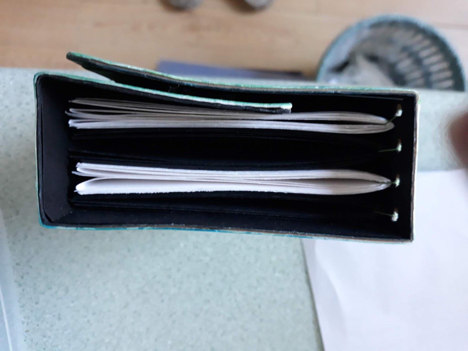
I alternated black and white (undecorated) pages inside, which consists of 4 sets (or signatures) of pages.
  
Spine, showing the thread that holds the folded signatures together.

You can see where some of the black lining card is cracked and curling. I've put this right now, but this is a learning curve...
Sorry it's so photo intensive, but I wanted to show you the snags I hit upon to make it easier for you if you want to attempt one of these.
I will sew the signatures next time and will definitely use a lighter weight card. I quite like the idea of 'lining' it, though. I like that effect.
I have more cut and ready to go and it's looking as if I'll have lots of time to complete one or two more, if the movement restrictions continue.
Linking to:
Addicted to Stamps and More, Make Your Mark (watercolour and Prisma pencils on butterfly)
Creative Artiste Challenge, Anything Mixed Media
Blank Page Muse, Anything But a Card
Mix it Up, Anything Goes
Not Just Cards, Anything Goes

Thanks for calling in today
I'll be back soon
Cath
xxx

Friday, 20 March 2020

Today I'm sharing a card to remind us that we are far bigger than anything that can happen to us. This little girl, standing on a torn bit of Washi tape - Stampinback or 100 Proof Press, I think - is one of my all time favourites. I think I like her because she looks a little mischievous, despite her innocent look. The background is smooshed Oxides - Broken China, Iced Spruce, and a little Cracked Pistachio. You can see Aall and Create stamps an stencils and a little TH die cut in the top corner, that just seemed to balance the whole thing. 
I seem to be using a lot of blue, green and lilac at the moment - this one is Peacock Feathers and Twisted Citron and feels very serene...the Flowers are Lavinia Stamps. I hope you can see the stencilled Brilliance Resist background - it worked perfectly. I just stencilled Brilliance Platinum Planet ink, then added colour. Such a quick and simple effect. I think both number stamps I used are Paperartsy and the text is from an old grab bag from someone in the US who used to do some wonderful ones, maybe Paper Roses or something similar? I have a box of background stamps and forget which comes from where.
Linking to
Mix it Up, Anything Goes, with Optional Smooshing (both smooshed)
I'm thinking of you all, and my heart goes out to anyone who has been affected by the virus - especially if you have or had someone seriously ill because of infection. We really don't need to be afraid, but we do need to take sensible precautions and follow advice, especially if we are in the vulnerable group. 
As the world changes around us, the internet is one of the big blessings, keeping us connected. I'm very grateful for my phone, too! My 81 year old mum may be in New Zealand, but it's great to be able to text and find out how she is.

I seem to spend half my time trying to get essential shopping done, running to the various shops around. 
I was surprised to find my local open air market 75% open this morning and crowded! I got my bread from the bakery - but it was the last one. All toiletry and food shelves are empty! The panic buying is far more scary than the actual virus is, actually creating a shortage of items when there's absolutely no need.  

Thank you for calling in today
I'll be back soon
God bless you all. Stay safe!
Cath
xxx

Tuesday, 17 March 2020

Good Morning!
Time for a new challenge from Try it on Tuesday
and today that challenge is
Home Sweet Home/Where Would you Like to Live?

My first thought was that it had to be France, my favourite place. But I've already tried living in France for a short while and, although I loved every minute of being there, speaking French, I missed my friends and family too much (as did my elder son) and came back 'home'. I considered an imaginary place - that was tempting - or another part of the UK, the Scottish Isles, maybe. But my heart kept coming back to the people I care about and the truth that I feel 'at home' when I can relax and just be me, usually with the people I have shared history with, even if that history is more recent with some.

The background is a gorgeous blend of bright Oxide shades, over which I used a baby wipe through a couple of stencils to remove some of the colour. This technique works best when you use a lot of ink and the colours are quite intense.

I added some stamped and fussy cut Stampendous Houses, coloured with Prismas and Inktense pencils, then some Die cut letters and single letter stamping on white card, making the words 'Wherever I can be me is Home'. The heart is cut with a VERY old Sizzix die - one of my first, given to me with my old red Sizzix - a long time ago. I stencilled a little colour on it, to detract from its plainness and used it in place of the letter 'O'.
I used washi tape at the bottom to represent grass. It's now a page in a journal. 
Colours used are Picked Raspberry, Salty Ocean, Mustard Seed and Toasted Marmalade.

I hope you'll visit the Challenge Home Page and see the Design Team's beautiful creations - so much variety. 
We'd love to see where your heart calls home and look forward to seeing your fabulous entries in the next two weeks.

Thank you for calling in today
Back soon
Cath
xxx

Thursday, 5 March 2020

Good Morning!
Just sharing an offshoot from my challenge card for the current New Technique Challenge at Try it on Tuesday

Before I decided to do a 'full front' card, I had originally intended to do this design... again using Red, Yellow and Blue inks, but this time through an Ink Blot Stencil. After spritzing with water and allowing to dry, I realised it wouldn't work with a sentiment and I wasn't happy with the amount of blending... my 'ink blots' weren't quite close enough to create the effect I was after.
This was the one I was hoping to use my alphabet dies (YES, I'm still hunting for my 'T'!)  on it. They would've been the perfect size. I could still have used them with lower case dies, but because my original plan was foiled, I changed tack. I was still left with this one, however and it was too 'interesting' to waste, so I simply added a white die cut Happy Birthday and did a little 'happy spattering' with all three primary colours. This one was made with Distress Inks, not Oxides. I love the blending, even though it didn't work out quite as well as the one I chose to use.
It makes a great card for a man - or boy - quite versatile - with or without the hearts 😉  or stars or whatever you choose to add...
Linking to Seize the Birthday's current challenge, 'Sentiment as Focal Image'.

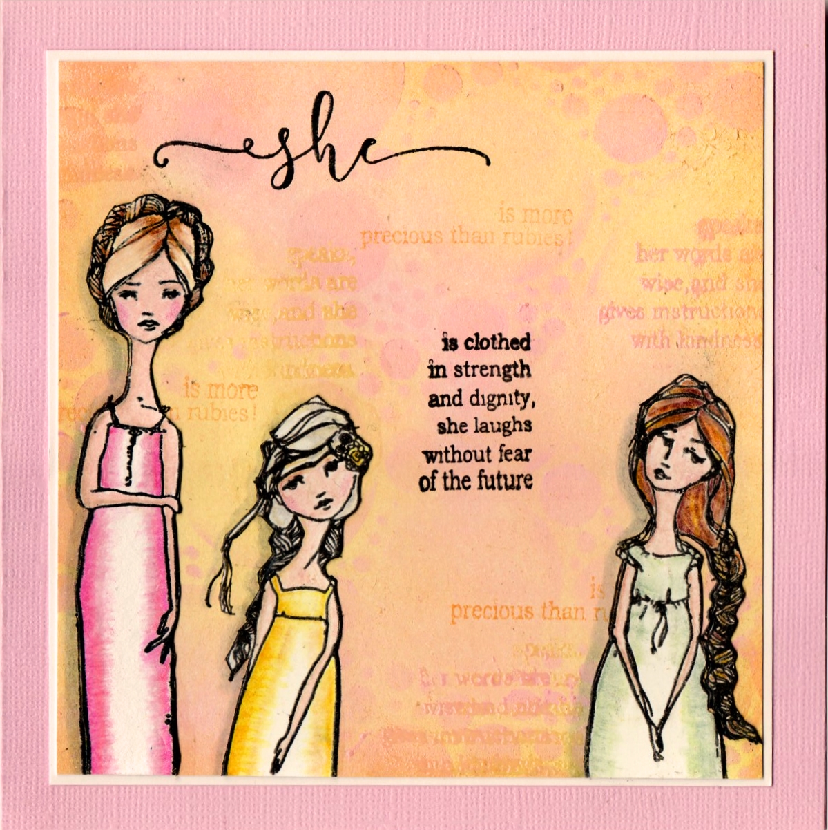
I made this one for a very precious friend who's having a bit of a hard time...I wanted to remind her that she is a Proverbs 31 woman 😊 
It's now been delivered so I can share it. 
The background is Versamagic inks - nice and chalky. I am determined to use more of my stash and I don't think there are any really pale inks as good as these...I knew it had to be a pastel background. The girls are lightly coloured with Prismas.
I'm linking it to Simon Says Stamp Wednesday challenge, Something Feminine

Thank you for calling in today
Back soon
Cath
xxx

Tuesday, 3 March 2020

...or style, or medium, or....?

Crafting time has been short for me lately, but this is a great opportunity to try something I haven't done before. So I thought I'd try the Eclipse Technique. 

I kept it simple because time was short, but also so that I could master the actual technique. I planned to use my alphabet dies to say 'ART', so I duly hunted out my letters and agghhh! I can't find the upper case 'T'. That took up even MORE time, sorting through all my dies and sorting them further into sets - but no. I was left with the option of using a lower case die OR using another word. My dies are quite big, so I only had limited choice. So, I decided not to use my lovely alphabet dies (bought partly for this purpose) and to use a word instead. 

To keep it simple, I used one of my favourite inky techniques, using primary colours to create a rainbow. I sponged my card in Red, Yellow and Blue, overlapping the colours. 
My Candied Apple Oxide was in a mess, so I had to use Festive Berries, which is slightly more brown in colour.
I then spritzed with water, to blend the colours more. Here you can see that the colours are beginning to move around and blend together.
Once dry, I flicked with water droplets, drying with my heat tool, then stamped an overall pattern, using an old Stampendous stamp - just to keep it simple - (I overlapped it, which spoiled the effect a bit, but you can still see the way the Eclipse technique works.)

Next, I  die cut the Happy Birthday from the stamped card, then five times more in white card. After gluing them one on top of the other, finishing with the stamped card, I replaced them in the space created by the first die cut, using the coloured 'leftovers' to fill in the bits inside the letters that the die had removed. 

This is the result. It's NOT perfect - some of the letters slipped while adding more layers and I hadn't noticed - but it still works and that shows that you really don't have to worry about getting it absolutely perfect 😉.
And these photos show the raised dies a little better ... as well as the lovely water splatters.
 
I much prefer the red in Candied Apple for the rainbow effect - it blends better and is a truer red, thus making a truer orange. 
I've made sure to clean my inkpad again for next time (it had sort of exploded and leaked all over everywhere - again - yuk!)

It's a very simple example of this effective technique, but I hope it illustrates it clearly enough. 
It IS more fiddly than I expected, but that's mainly because of the fiddly little bits inside the letters and my poor dexterity. If you can use tweezers, which I can't do well, it would simplify it a little.

Rosie, my (very talented) teamie, created a few lovely scenic examples of this, well worth a look! If you scroll backwards from this link, you'll see a couple more.

The TIOT Design Team have created some wonderful examples of other techniques for you to see, so please go have a look...
I hope you'll join us for the next fortnight and share your new techniques 😊
I'm sure that like me, you'll always get excited by new ways of creating art!
I look forward to learning from yours.

Thank you for calling in today
Back soon
Cath
xxx